Cal Schenkel’s Frank Zappa Album Covers
The iconic artist Cal Shenkel discusses just a few of his most striking sleeves for Frank Zappa.
As well as being a pioneering and self-taught composer, incredible guitarist, genius editor, marketing innovator, and keen filmmaker, Frank Zappa had an instinctive understanding of the importance of how his music was presented. From the beginning of his career, provocative, funny, and surreal album covers helped Zappa set himself apart from his contemporaries. Zappa’s sleeves were pop art in the truest sense – conceptual and boundary-pushing artworks that made it into homes worldwide.
From 1968’s We’re Only In It For The Money onwards, Zappa’s accomplice in aesthetics was the artist Cal Schenkel. The pair met briefly in 1966, when a 19-year-old Schenkel was picked up while hitchhiking and dropped off at the recording sessions for Zappa and The Mothers Of Invention’s debut album, Freak Out!. The following year, Zappa was looking for some help with his visuals and Schenkel’s then-girlfriend, singer Sandy Hurvitz, recommended the artist. Schenkel started to work on advertisements for live shows and albums and soon graduated to record sleeves.
Schenkel went on to design 15 covers for Zappa during the composer’s lifetime, plus three posthumous sleeves, while contributing countless design elements to Zappa’s album packages. There’s no better person to explain Zappa’s album covers, so we spoke to Schenkel for a rundown of some of his most enduring artwork.
We’re Only In It For The Money (March 1968)
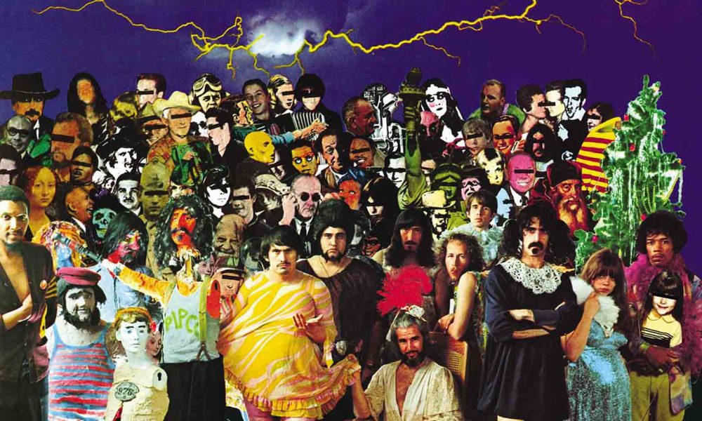
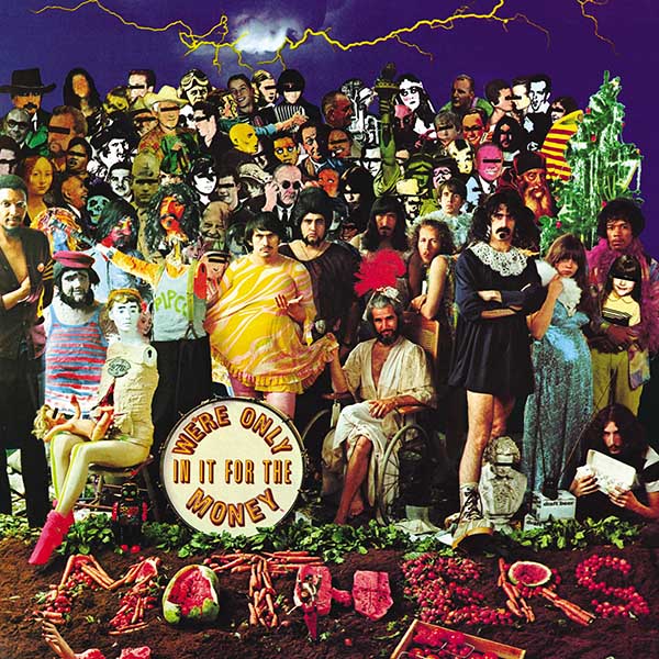
The first album sleeve Schenkel worked on was one of Zappa’s most controversial, thanks to its parody of The Beatles’ Sgt Pepper’s cover. But Zappa’s original idea for the album was very different, as Schenkel told us, “Frank was working on a project called Our Man In Nirvana, which included some Lenny Bruce material that Herb [Cohen, manager] owned. Frank had done some preliminary design work for Our Man In Nirvana; he had a fairly simple line drawing of a profile of a head, almost child-like in scale, that was gonna be the cover. He was going to then use the drawing on the bass drum on the cover of We’re Only In It For The Money until that further evolved. When The Beatles released their landmark album, everywhere you went that summer, you would hear it,” Shenkel reflects. “So immediately, the idea changed.”
Zappa tasked Schenkel with assembling the cast for his satirical take on Peter Blake’s iconic cover, “Once the concept was established, Frank took a piece of tissue paper, put it on the Sgt Pepper’s sleeve and drew around the figures to show me his ideas for the people that he wanted on there. One was Jerry Mahoney, this puppet character who was big in America. He wanted a Varèse bust, which, of course, I couldn’t find. And Jimi Hendrix was immediately part of it because he was hanging out with Frank at the time.
“If I couldn’t find specific people, we came up with an alternative. Among other things, Frank gave me his high school yearbook and said, ‘Here, just chop up people out of this.’ Probably about 10 of the people on the sleeve are from Frank’s yearbook!”
Not for the last time, Schenkel himself made an appearance on the sleeve: “I’m in the bottom right corner holding a box of eggs and then in the top left corner, playing the accordion. Eggs were a running joke because I would work part-time at my little loft uptown, then the rest of the time, I would work in Frank’s apartment on Charles Street. He’d be in one corner of the room cutting tape up into little pieces, and I’d be working in the other corner at a drawing table. We’d work for hours and I’d get hungry, so I’d go to the refrigerator and basically, the only thing to eat in there, besides ice cream, was eggs. So I ended up making eggs a lot.”
Listen to the best of Frank Zappa on Apple Music and Spotify.
Zappa and Schenkel’s satirical tableau ended up being tucked away on the inside sleeve of the album after his record label – apparently worried about legal action – replaced it with an image of the Mothers on the front cover. “I think a lot of the issue was just them being so timid at MGM because it certainly qualified as satire,” says Schenkel. There was a happy ending, as later reissues restored the image to the front cover of the album.
Lumpy Gravy (May 1968)
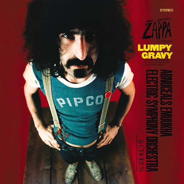
Though the cover for Zappa’s companion piece to We’re Only In It For The Money had been shot before Schenkel was on board, the artist was called upon to add some distinctive collages to the gatefold sleeve. “That was after we came back from Europe – I went along on the first European tour [Summer 1967] as a photographer. I wasn’t really a photographer, but I was on the payroll at that time. So, since there wasn’t anything else for me to do, they took me along for that! When we got back from that tour, Lumpy Gravy was the first project I really started on.”
From the beginning, Schenkel’s idiosyncratic approach to his art resonated with Zappa: “I like to put personal references into my work, which kind of fits with Frank’s conceptual continuity, the Project/Object idea.” Zappa’s overarching theory was that all of his work – music, art, film, live shows – were interconnected and worked together to tell one story. Schenkel’s artwork – often packed with references to previous albums or visual in-jokes – was perfect for the Project/Object. “The little cartoon guy in there, kind of in the middle of everything. That was a different ad that we did for Moop Records earlier. And the collage of Frank that’s made up of all the little photos was from a shot I took when they were having lunch or something [laughs]. And the photo of him with a T-shirt on – that was my high school gym shirt.”
Cruising With Ruben & The Jets (December 1968)
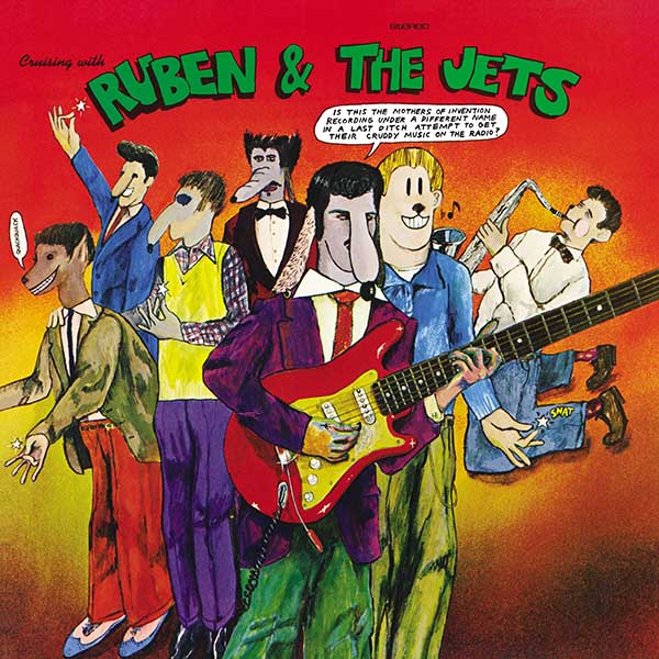
Zappa’s third album of 1968 was also his first to feature a Schenkel illustration on the cover – a cartoon depiction of Zappa’s fictional dog-snouted doo-wop band, Ruben & The Jets. Schenkel took inspiration from the cartoons of his youth for the illustration: “I was a big fan of Carl Barks, who did the Disney ducks and all the funny animal comics. I found all the superhero stuff very boring, but Carl Barks did very complex, interesting, and funny stories. They were really a classic type of delivery and influenced a lot of artists of my generation, including Robert Crumb.”
And again, Schenkel managed to include a nod to his past, this time his earliest work with Zappa, “The jellyroll illustration [a how-to guide to achieving a perfect greaser hairstyle, included in a promotional package for the album and reproduced on the 2012 CD reissue]; was fun to do and it fitted in with the dog snout characters on the cover. Again, some of that goes back to those ads that I did for Moop, which were surrealistic comic strips, basically. Frank liked that concept.”
“And so I was playing with the animal nose type thing. At one point, we were going to do these rubber noses for the band to wear. We took a cast of Frank’s nose in order to do that.
“I used some acrylics, some watercolors. The background is Krylon spray paint, because I didn’t have an airbrush to work with at the time, so I just used a spray can. It’s incredible. I like to work in all different media, so it was good for me. Collage works well too, because then, if you make a mistake, you can change it easily.”
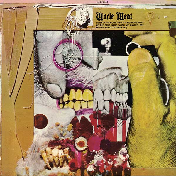
Uncle Meat (April 1969)
For the cover of Zappa and The Mothers’ experimental masterpiece, the sprawling double-album Uncle Meat, Schenkel was inspired by something closer to home, “Until that point, we were living at a log cabin. I had a separate wing that was my art studio and living quarters. When Frank decided to move out, I had to find another home and studio space.
“I found this place on Melrose Avenue, Hollywood, that used to be a dentist’s office. An old guy had retired and left a bunch of this junk behind, including old dental books and magazines from the 20s and 30s. Plaster casts, dental X-rays, real teeth, a whole room of those out the back. In the meantime, there was no actual concept for the cover. With Frank, things were constantly in flux. The most recent iteration of that album was called No Commercial Potential. Then, suddenly, it became Uncle Meat. Now, at that time, the Mothers were on tour in Europe. And they needed a concept right away. So I just sat down and said, ‘Well, hey, look all this great stuff,’ and just put together an assemblage. The original is actually smaller than the album cover; it’s blown up.”
It was a time of enormous creativity, with Schenkel working overtime to keep up with Zappa’s various projects, “At the time, I was playing a lot with the dark room. And Ed Caraeff, the photographer that we used quite a bit after that, had just come on to do some work. We shot Captain Beefheart’s Trout Mask Replica cover, An Evening With Wild Man Fischer [1969 album produced by Zappa], Uncle Meat, and all these other projects simultaneously in that little dentist’s office space.”
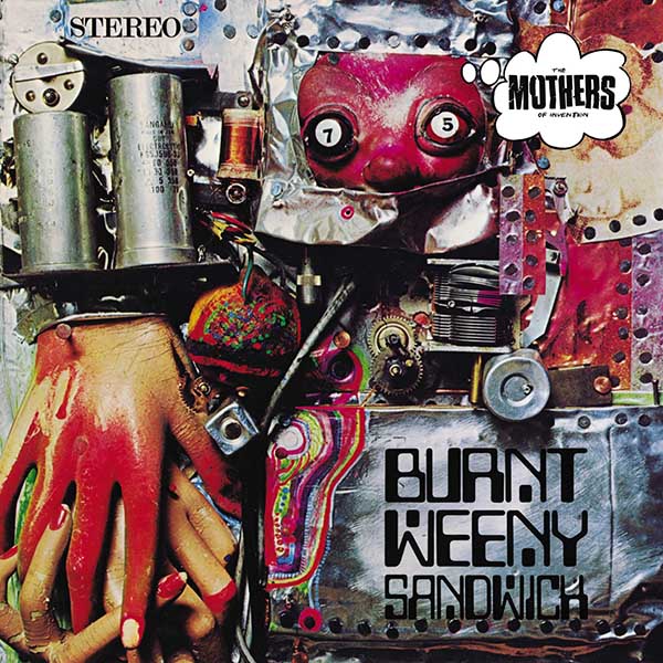
Burnt Weeny Sandwich (February 1970)
Though Burnt Weeny Sandwich was put together while Schenkel wasn’t working directly with Zappa, the composer used an old artwork for its cover. “Frank used an assemblage that I did back when we were still in New York. It was done for one of those Moop Records covers for an Eric Dolphy album [Moop boss Alan Douglas had hired Zappa’s Nifty, Tough & Bitchen advertising company to design a number of adverts and sleeves]. It wasn’t released, but Frank still had the art. So, while I was gone, they used that cover, and John Williams did most of the production work on that. Then, when I got back, I resumed working for Frank.”
Moop Records’ loss was Zappa’s gain – Schenkel’s assemblage uses old electrical components, along with some nods to previous covers (“The mannequins that we had from We’re Only In It For The Money, and probably some other junk in there too”) to create a sci-fi junkshop feel that was totally out of step with the flower power sleeves of the time. “The psychedelic stuff didn’t really influence me that much,” Schenkel agrees. “Everybody else was doing that, and I was more influenced by Dada, the surrealists, comics, everything else. I wanted to do all kinds of stuff. So if I did anything psychedelic, it would have been satirical.”
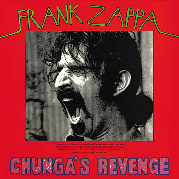
Chunga’s Revenge (October 1970)
While the cover shot of a yawning Zappa taken by Phil Banks was an arresting and rebellious image, it didn’t prepare fans for the Cal Schenkel illustration that dominated the album’s gatefold sleeve. The painting (“water-based, probably acrylics and watercolor on paper”) is a literal interpretation of the small text on the cover beneath Zappa’s image, “A gypsy mutant industrial vacuum cleaner dances about a mysterious night-time campfire. Festoons. Dozens of imported castanets, clutched by the horrible suction of its heavy-duty hose, waving with marginal erotic abandon in the midnight autumn air.”
“I think the actual concept of this mutant industrial vacuum came from one of the Mothers,” says Schenkel. “They were playing with the vacuum that they used in the studio to suck the dust off the vinyl while they were cutting it. I’m not sure who actually came up with it, but somebody was just playing with it. And it became a thing that Frank took off. The illustration essentially just came directly from that line that’s on the cover. I didn’t really need any more direction.
“My grandfather was an artist. An amateur artist, but a very good one. I recalled from my childhood this painting of a gypsy camp that he did, and this really influenced my idea for the camp in the painting. It’s nothing complex; there’s a gypsy girl whirling with the skirt, and there’s this guy with a guitar by her side, and there’s a fire in the background. Other than that, I don’t remember too much of the details, but I do remember how it felt as a little kid, you know, looking at this painting, the atmosphere that it created – I tried to put that in the illustration. The painting was my father’s. I still have it.”
Though the subject matter is surreal, the painting itself is among the most traditional Schenkel had produced for Zappa, calling to mind a vintage illustration of a scene from Grimm’s Fairy Tales. As ever, though, there was a twist – the scene is framed by a window of a control room and being controlled by the hand of a mystery figure. “Frank might have said, ‘have me in the control room’ in the illustration,” reveals Schenkel.
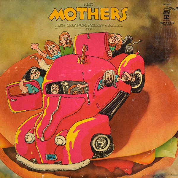
Just Another Band From LA (March 1972)
This Schenkel cover is packed with Easter eggs for Zappa fans. The artist even invited the audience to look for them with a message written on the bottom right-hand corner of the original cover, “Any visual similarity between the cover of this album and the Uncle Meat illustrated booklet (not to mention Ruben & The Jets) is thoroughly intentional and contains 4 secret clues.”
Again, Schenkel took inspiration from his own life for his artwork, “I had a 1939 Pontiac at the time. I drove that car cross-country when we moved from New York to California. So that was the major influence on that design. Of course, then there was the pachuco influence from Cruising, that was part of it. And California and the burger, it was all in there.”
The first side of the album was taken up with the nearly 25-minute absurdist satire of “Billy The Mountain,” which provided the inspiration for the gatefold photograph of Schenkel at work. “I’m not sure if it was ever finished or not, but Frank wrote a screenplay to create ‘Billy The Mountain’ as an animated story. It might have just been a summary at that point. I’m not sure. But I saw that probably even before I heard the album. And so I started storyboarding some of those ideas. I didn’t really have a lot of time to get real into it, so all the stuff in the photo on the inside is mocked up, just to make it look like a storyboard.”
And those four clues on the front cover? The giant cheeseburger in the background is a reference to “Cruising For Burgers” from Uncle Meat. The furry dice in the Pontiac are also a nod to the dice on Uncle Meat’s cover. And the cartoon Zappa has a dog’s snout, while the sound effect “Snat” appears near his feet, both throwbacks to Cruising With Ruben & The Jets. Meanwhile, Schenkel put Zappa’s leg in a cast – a reference to the incident in December 1971 when Zappa was thrown off stage at London’s Rainbow Theatre by a deranged fan and suffered debilitating injuries.
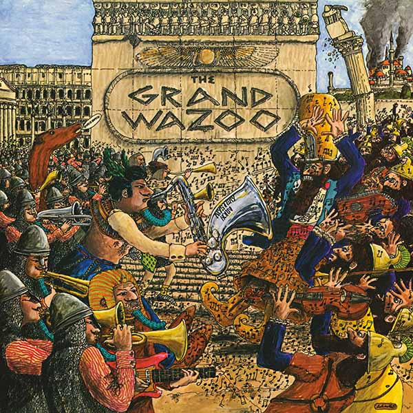
The Grand Wazoo (November 1972)
One of the albums made during Zappa’s enforced period off the road, The Grand Wazoo featured one of Schenkel’s most intricately detailed cover illustrations, based on the story printed on the inside of the album of a musical battle between the horn-toting armies of Cletus Awreetus-Awrightus (The Funky Emperor) and Mediocrates of Pedestrium. “The basic concept was really all I needed,” says Schenkel, “because once I had the two characters, the rest was just a matter of finding imagery I could borrow from National Geographic or whatever to make it look historical. It’s pretty much this battle of the bands or battle of civilizations – Western and Eastern, to some extent Middle Eastern and Christian, maybe, I dunno!”
The back cover was just as intriguing, featuring a Schenkel drawing of the character Uncle Meat in his laboratory. “The illustration is very specific to Frank’s description of the old guy, Uncle Meat, in his story. Then the eyeball plant was a take-off from the photo on Waka/Jawaka – that false aralia that looked like a marijuana plant.
“The funny thing about the back cover is the way that the old guy came out. He looked just like my grandfather. It wasn’t really intentional; it just happened that way. And there’s a funny story about that because my uncle – my father’s brother – had a restaurant and bar out in the country, and there was a Zappa fan who came in occasionally. When he found out that I did some of the covers, he brought that album in and showed it to my Uncle Ernie, who said, ‘That’s my pa!’ It was really funny; he’d never seen it.”
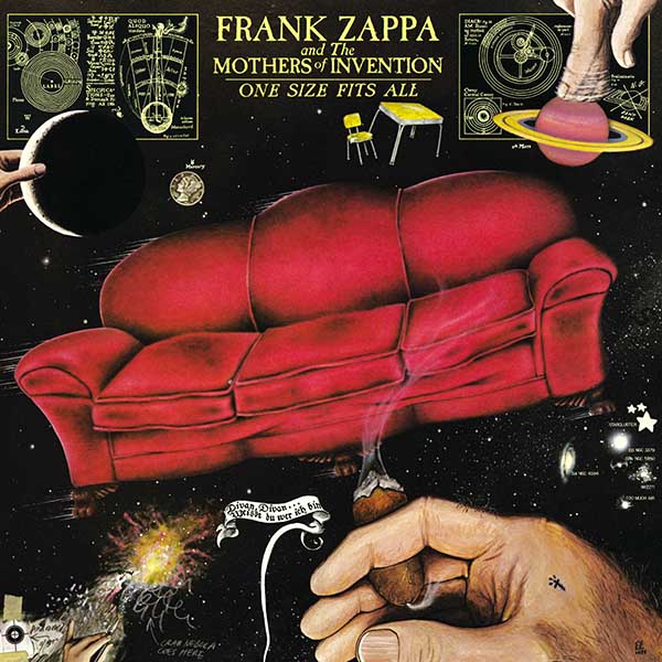
One Size Fits All (June 1975)
The enigmatic artwork for one of Zappa’s most beloved albums demonstrates Schenkel’s generosity. “That’s one of my favorites,” he says. “Basically, I drew the sofa and had the whole thing worked out. I was working with Lynn Lascaro on some other projects, book covers, that sort of thing. His specialty was working with pastels on velour paper, so I thought it would be a great job for Lynn to do the sofa. So he gets the credit for the velour pastel sofa, which is glued down on the background painting.”
The back cover was just as spectacular as the front – a detailed star map with names and references relating to the Zappa universe, along with some personal touches from Schenkel and Lynn. “We’d just be hanging out and goofing on star maps, you know, like National Geographic star maps, coming up with names for these alternative constellations and stars. There were one or two that Frank suggested when I showed him what I was doing.”
When Schenkel updated the album cover for the 1987 Old Masters box set, he added several new stars to the map with dedications, including Gail Zappa, Zappa’s four children, and even the Zappa family cat and dog. When the album was reissued on CD in 1995, Schenkel added Zappafrank, a real asteroid named in Zappa’s honor the previous year.
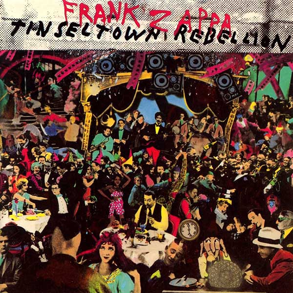
Tinsel Town Rebellion (May 1981)
After a period away from working with Zappa, Tinsel Town Rebellion marked Schenkel’s return to cover art duty and came about thanks to an impromptu visit to the Zappa home. “In early 1980, I was in California for a pretty extended period, staying with my friend, Chuck Swenson, an animator who worked on the “Dental Hygiene Dilemma” section of 200 Motels.
“Chuck lived in the Hollywood Hills. So one afternoon, we were driving home to his place, and we passed by the Zappa’s place. This was the first time I had been by since I was out for that spell and we hadn’t spoken for a while. And in the meantime, Frank had done all this construction work and it was totally different. So we said, we’ve gotta stop and say, hi, and see what’s going on. So I just rang the doorbell. Gail answered, Frank wasn’t there, but we went up. When Frank came home, we chatted for a while. And he said, ‘Well, I got a job for you if you’re interested.’ So the first thing I did for him was the sleeve for [1980 single] ‘I Don’t Wanna Get Drafted’ – the band photo and the illustration on the other side. Shortly after that, he wanted me to do the graphics on a tour book. We did a very quick version to go to Europe. And then I worked on a more involved version for the States.
“One of the two-page spreads in the tour book was this illustration similar to the Tinsel Town Rebellion cover. It’s a real rough version in black and white with a little color here and there. Frank really liked the way that came out, as well as the rest of the tour book. He called me and said let’s use this for the cover of the next album. It was actually called Crush All Boxes at the time – you can still see that original title on the finished cover, just behind ‘Tinsel Town Rebellion.’ And I said, ‘Well, I love the idea, but I can do a much more elaborate version and really get into it.’
“I would go to the library and look in the movie or theatre section or whatever section had a lot of behind-the-scenes photos from films. Whatever hit me, I would just grab it make a copy and collage it together. It’s all very organic, the way I work on stuff like that. I’ll start out with the concept and usually I’ll find one piece that sets the stage. Then I’ll find other elements to put in the foreground, and I’ll play with changing the character or putting somebody else’s head on a different body. I’m on that cover too, on the left side sticking my head in there, and of course, Ralph, the cartoon dog I first used for those Moop ads is on there too – it’s a recurring theme.”
Despite his massive contribution to the Zappa catalogue, Shenker remains modest, “It didn’t really occur to me to think too much about how any of the work was part of any other larger meaning, except occasionally, if I saw an album in a store, I’d think, ‘Wow, I did that.’ I just wanted to do the art – it was fun, and I was getting paid for it.” Yet Schenkel’s artwork and Zappa’s music are inextricably linked, with each artist’s imagination firing the other’s creativity. It’s difficult to think of these classic albums without picturing their sleeves, which is testimony to Schenkel’s unique genius.
Shop Frank Zappa’s music on limited edition vinyl and CDs here.