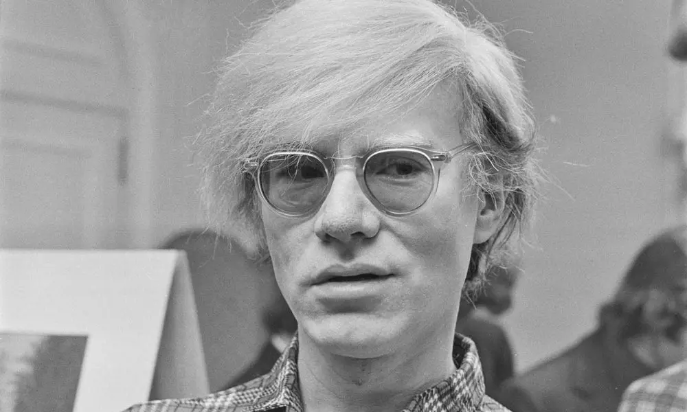
The Stories Behind Six Great Andy Warhol Album Covers
The giant of 20th-century art designed a number of iconic album covers.
For a big chunk of Andy Warhol’s life – from his 1949 arrival in New York through the early 1960s, just before he achieved celebrity status as America’s pop art poster boy – he kept the lights on by working as a freelance commercial artist. During that period, he created a ton of album covers.
But even after finding fame, Warhol kept a hand in album art design for the rest of his life. Throughout his career, he designed dozens upon dozens of covers for artists of just about every genre, from cult heroes to superstars. The best of those works are worthy of as much consideration as any other corner of his catalog.
Let’s look at a tiny sampling of Warhol’s most memorable album covers and uncover their origin stories.
Moondog – The Story of Moondog (Prestige, 1957)
Composer and multi-instrumentalist Louis “Moondog” Hardin was a pioneer of outsider music. Frequently a street performer, Moondog dreamed up a sui generis mix of jazz, classical, primal, and avant-garde sounds, often playing instruments of his own design, sometimes while wearing a Viking helmet.
When Warhol was tasked with envisioning the cover for Moondog’s second Prestige LP, he drafted the calligraphic talents of someone he knew well and would call upon more than once: his mother, Julia Warhola. Andy’s artistic gifts didn’t emerge from a vacuum – Julia had an unusual, visually striking style of cursive writing. In a move unusual for album designs of the era, Andy made his mother’s hand-written version of the record’s liner notes the main feature of the front cover. The gambit paid off: Mrs. Warhola received an honor from the American Institute of Graphic Arts for it.
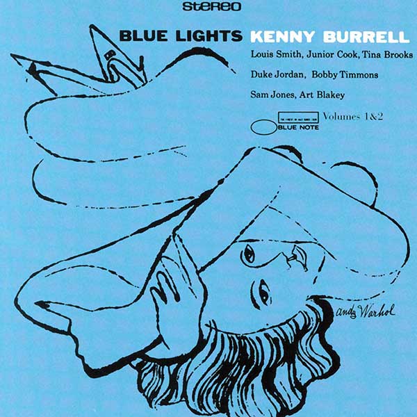
Kenny Burrell – Blue Lights (Blue Note, 1958)
The majority of Warhol’s pre-fame cover designs were for jazz records. He created album art for Count Basie, Artie Shaw, Thelonious Monk, Paul Desmond, and more. But the cover he came up with for jazz guitar giant Kenny Burrell’s Blue Lights had its roots in an unlikely aspect of Warhol’s work for hire.
Warhol had spent years illustrating print ads for the I. Miller chain of shoe stores. His work for the franchise, appearing every week in the New York Times, earned Warhol multiple Art Directors’ Club awards. Never one to miss out on maximizing an opportunity, he carried that inspiration over to his art for Burrell. The shoes and legs occupying the top half of the album cover could have come straight from one of Andy’s I. Miller drawings. The cover proved popular enough that it was repurposed in pink for Blue Lights Vol. 2 three years later.

Click to load video
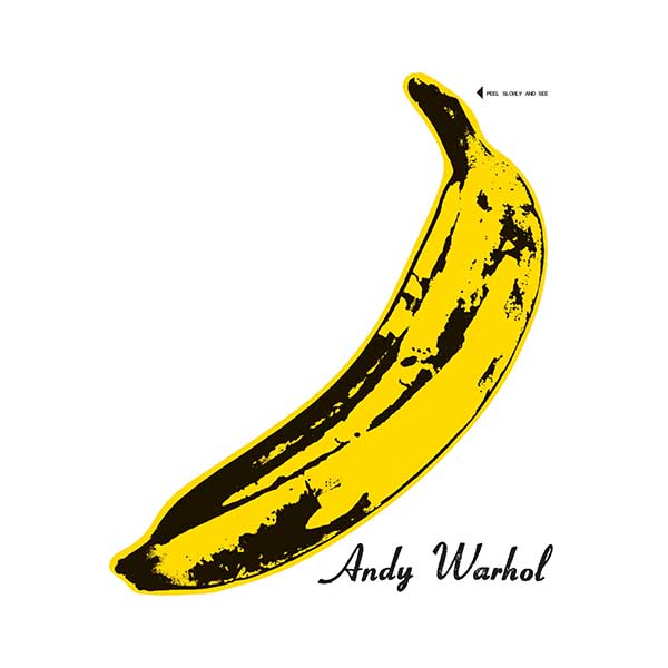
The Velvet Underground & Nico – s/t (Verve, 1967)
The “banana cover” Warhol created for the self-titled debut of The Velvet Underground & Nico (whom he was managing and nominally producing at the time) is not only his most famous album design but one of his most widely known works in any medium and an iconic piece of 60s pop art.
Like Warhol’s career-making Campbell’s soup can, the banana cover was part of his agenda for turning everyday images into artistic statements. But the original version also had a sexual suggestiveness that matched the VU’s lurid songs of NYC street life. On the album’s first pressing, the peel pulled back to reveal a naked, hot pink banana underneath. The effect was unsustainably expensive, and future pressings were strictly two-dimensional.

Click to load video
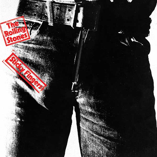
The Rolling Stones – Sticky Fingers (Rolling Stones Records)
Warhol was always aiming upwards, and his cover concept for The Rolling Stones’ first studio album of the 70s took the suggestiveness of the Velvet Underground album to another level. Instead of a banana with a removable peel, buyers of the original Sticky Fingers were confronted with a crotch-level shot of a man in tight jeans who was clearly, shall we say, dressing to the right, and the zipper pulled down to reveal the underwear beneath it.
As with the Velvet Underground cover, prohibitive production costs limited the special effects to the initial pressing. But considering that the cover model was Joe Dallesandro, a Warhol protege best known for appearing nude in Andy’s 1968 film Flesh, the surprise beneath that zipper could have been a lot more scandalous than it was.
John Cale – The Academy in Peril (Reprise, 1972)
Warhol liked to explore a concept across multiple pieces (more on that in a minute), but his cover for former Velvet Undergrounder John Cale’s second solo album seems to occupy its own exclusive territory. Warhol’s die-cut design symmetrically displayed 21 closeup photos of Cale’s eyes and four of his face, all represented as Kodachrome slides.
The idea almost had a predecessor – Warhol worked on a similar concept for Cale’s first album, Vintage Violence, but it was scrapped when the longhaired Cale had his locks shorn and no longer resembled the photos Warhol was using. In lieu of charging Cale for his Academy in Peril cover, Warhol got permission to use the album track “Days of Steam” in his contemporaneous film Heat.
Diana Ross – Silk Electric (Capitol, 1982)
One of Warhol’s most frequent tactics, especially in later years, was to display a photo with an Epidiascope (opaque projector), and use that as the template for a painting. He was reportedly doing it as early as his design for Count Basie’s self-titled 1955 LP, and over the years, he applied it to album cover images of everyone from Paul Anka to Billy Squier.
One of Warhol’s most effective applications of the technique was for Diana Ross’s Silk Electric. A popular 1976 cover photo of Ross for Andy’s Interview magazine, taken by Richard Bernstein, provided Warhol’s inspiration. But the basis for the album imagery itself was the recent pictures he’d taken of Ross, who had commissioned photographic portraits of herself and her three young daughters. The October 2, 1981 entry in The Andy Warhol Diaries reads, “Diana Ross came at 3:00 and she loved all the portraits, she said, ‘Wrap them up,’ and they all fit in the limousine, and she had a check at Bob’s place by 5:00. And she wants me to do the cover for her next album.”
Bibliography
The Dead Straight Guide to the Velvet Underground and Lou Reed – Peter Hogan
The Art of Jazz: A Visual History – Alyn Shipton
The Andy Warhol Diaries – Andy Warhol, Pat Hackett
www.artistsbooksandmultiples.blogspot.com
www.thehistorialist.com