Thin Lizzy’s Album Covers, Explained
Phillip Lynott and artist Jim Fitzpatrick brought their love of the Marvel, Celtic mythology, Irish poetry/literature, and sci-fi to life on Thin Lizzy’s album covers.
With the charismatic Phillip Lynott as their lead singer, it came as little surprise that Thin Lizzy would have a strong visual component for their album covers. Once they established themselves as a viable commercial entity, however, they were able to oversee (notably through Lynott’s insistence) the design of their records. From their third album onwards, the band left their record label’s in-house design studios, and gave the job to their trusted illustrator friend and fellow Dubliner, Jim Fitzpatrick.
Between the two of them, Lynott and Fitzpatrick brought their mutual love of the Marvel comics aesthetic, Celtic mythology, Irish poetry/literature, and sci-fi from basic concepts to end results. Fitzpatrick’s realization of these ideas presented a smooth marriage of rock group ideology and illustration that has rarely been so closely matched.
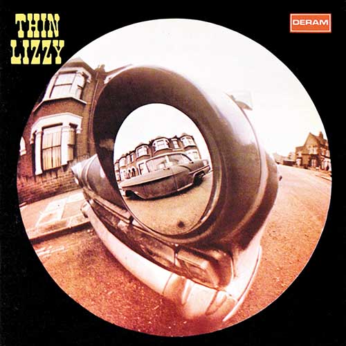
Thin Lizzy – Thin Lizzy
(1971, design by Decca in-house; cover art photograph by David Wedgbury)
Thin Lizzy signed with Decca Records on December 1, 1970, and within five months their debut album was released. The appealing fisheye lens cover image was taken by David Wedgbury, the first staff photographer to be employed by Decca. Wedgbury quickly gravitated towards art design for the label, and then creative studio manager. He died suddenly in 1998, aged 61, having photographed 1960s music talent that would change pop culture forever.
The back cover photography is attributed to Jennifer Edwards (although Dublin photographer Roy Esmond’s uncredited work is also featured). “The work of our department,” wrote David Wedgbury in the preface to his photography book, As Years Go By – the 60s Revolution at British Decca, “did much to establish and influence the emerging art of pop photography.”
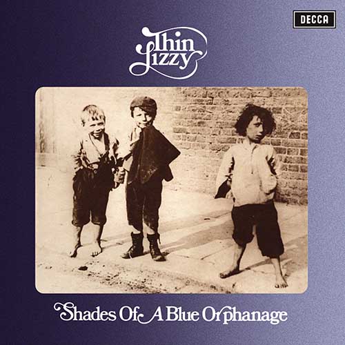
Thin Lizzy – Shades of a Blue Orphanage
(1972, design by Decca in-house; cover art photograph by Radio Times Hulton Picture Library)
The evocative sepia-tinted cover image of three shoeless waifs (originally titled Street Urchins at Lambeth, by Paul Martin) was clearly intended to represent vocalist Philip Lynott, guitarist Eric Bell, and drummer Brian Downey. The title of Thin Lizzy’s second album, meanwhile, referenced previous bands for Lynott (Orphanage) and Bell (Shades of Blue). Some of the album’s tracks also reference the suggested simplicity of the album cover: “Sarah” (the first of two Lynott-composed songs of the same title) was written for Lynott’s Dublin-based grandmother, in whose house he lived for much of his childhood. A lyric from the title track, meanwhile, (“the boys posed, standing in St. Stephen’s Green”) directly references the back cover image by Dublin photographer Roy Esmond of Thin Lizzy doing exactly that.
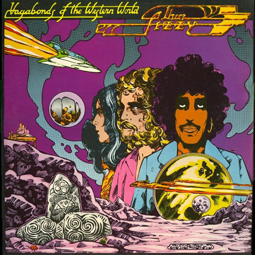
Thin Lizzy – Vagabonds of the Western World
(1973, illustrated by Jim Fitzpatrick)
Dublin artist Jim Fitzpatrick was introduced to Philip Lynott in Neary’s pub, in Dublin’s city centre, by Lynott’s friend and Thin Lizzy tour manager, Frank Murray (who would subsequently manage The Pogues). “Philip and I had a love of American comic books, poetry, Ireland and all things Irish, and a shared fatherless upbringing,” recollected Fitzpatrick. Commissioned by Lynott to design the cover for their third album, Fitzpatrick worked on the Thin Lizzy logo, which was based on a design by fellow Irish illustrator, and member of Dr. Strangely Strange, Tim Booth. (“I just glossed it up a little,” says Fitzpatrick.) Elsewhere, Fitzpatrick weaved in a pronounced Marvel comics and Celtic design aesthetic (in the latter, especially the triple spiral, which is symbolic of three domains: earth, sea and sky, and past/present/future). “This was my first artwork for Thin Lizzy and probably my most ‘out there’ album cover I did for them.”
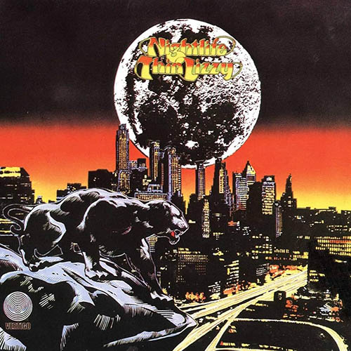
Thin Lizzy – Nightlife
(1974, illustrated by Jim Fitzpatrick)
The second Thin Lizzy album cover to be designed by Jim Fitzpatrick was, he said, “a slightly odd one.” A transitional work that presages the band’s classic twin-guitar line-up, the influence of Roger Dean in the title lettering is clear, while there is also an admitted influence by the work of Marvel comic strip artists Jim Steranko and Jack Kirby, both of whom Fitzpatrick and Lynott were passionate fans. “Philip was very sure of the direction he wanted to go,” says Fitzpatrick, “hence the sullen, moody, almost threatening cover.” The cover design, he recalls, was intended as a veiled political statement, but the pair kept that to themselves. The primed and poised black panther “was a silent tribute by both of us to great African-Americans like Martin Luther King, Malcolm X, Tommie Smith, John Carlos, the Black Power, and the Black Panther movement. We would have had a real job explaining that one to the record company!”
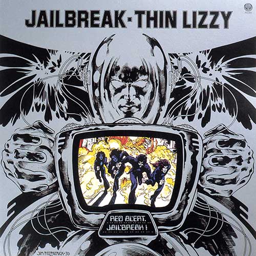
Thin Lizzy – Jailbreak
(1976, illustrated by Jim Fitzpatrick)
Thin Lizzy album cover number three with Jim Fitzpatrick, who at this point was completely in sync with Philip Lynott’s ambitious notions for cover artwork. The all-for-one-and-one-for-all bravado continued, albeit with a sleek metallic/robotic sheen and another pronounced Marvel Comics’ influence with a side order of H.G. Wells’ War of the Worlds. (Lynott would feature, coincidentally, in a 1978 rock opera version of War of the Worlds.) “Philip wanted something that reflected these influences and this artwork was the result,” recalled Fitzpatrick.
Together, he says, they worked on an imaginary story of The Warrior (referenced by the original inner sleeve concept outline and the album track, “Warriors” – “losers or conquerors, all flash past on my silver screen”) and “reworked the roughs to reflect this idea until it all held together. The influence of another great American comic book artist we both loved, Neal Adams, is all over this one. I loved the use of silver and we had to fight for it as an extra print run, though the record company were up for it anyway, so it got through.”
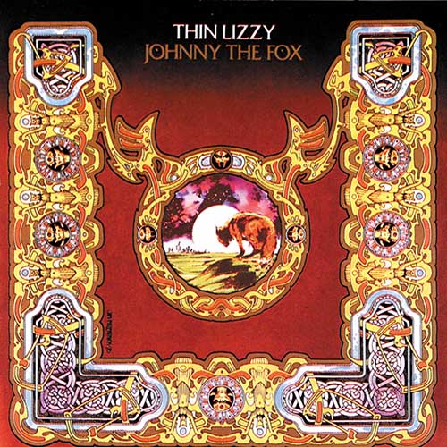
Thin Lizzy – Johnny The Fox
(1976, illustrated by Jim Fitzpatrick)
“The craziest design of them all” is how Jim Fitzpatrick describes his fourth cover design for a Thin Lizzy studio album (their seventh). Ornate by any stretch of the imagination, Fitzpatrick recalled that the artwork originally had a warrior-type figure in the center, but this was changed to directly reflect the album title. An early design idea of a cut-out with a fox’s head poking through it was replaced with an echo of Nightlife’s central panther. This, said Fitzpatrick, “reflected the idea of the outsider,” something that appealed to both he and Lynott. The intricate neo-Celtic metallic border took time to complete, but Lynott had requested something “very Irish and Celtic” minus any twee commercial Irish associations. “There is just enough Celtic knotwork in there to do the trick, while the rest of the border is sheer madness. I enjoyed every moment of its creation!”
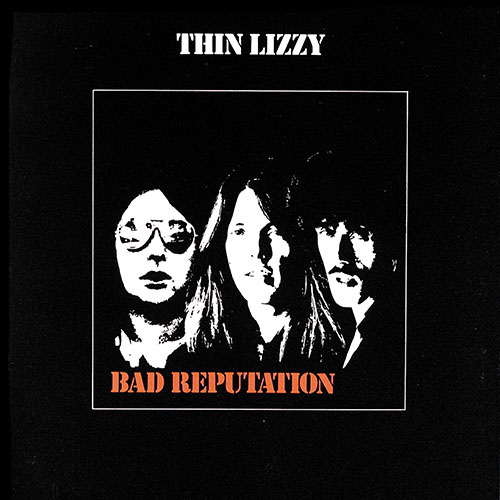
Thin Lizzy – Bad Reputation
(1977, design and cover art photograph by Sutton Cooper)
Unintentionally echoing the cover of 1972’s Shades of a Blue Orphanage by using a photograph of three people (Brian Downey, Scott Gorham, Philip Lynott), the monochrome and spot color composite cover was devised by design agency Sutton Cooper (AKA Roger Cooper and Linda Sutton). “The brief from Thin Lizzy’s manager, Chris O’Donnell, was to try out some visuals for the cover featuring only Scott, Brian, and Phil,” recalled Roger Cooper. “The final look was one of those ‘necessity is the mother of invention’ things. There was not a suitable photograph of the three band members together, so we fell back on the cliché of line reduction. That’s easy to do now in the likes of Photoshop, but tricky to get right in the 70s. For the band name and album title, we also introduced a punchier type font called Stencil, which was widely used to mark tour cases.”
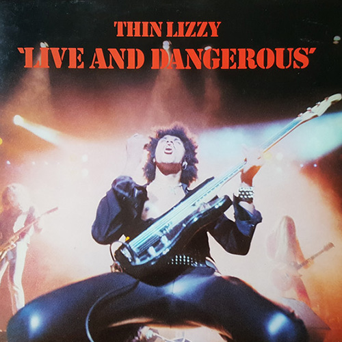
Thin Lizzy – Live and Dangerous
(1978, artwork by Sutton Cooper; cover photograph by Chalkie Davies; cover design conceived by Thin Lizzy and Chalkie Davies)
Live and Dangerous has the deserved status of being one of rock music’s most acclaimed live albums. While there may have been some sonic jiggery-pokery applied (various overdubbings by producer Tony Visconti), the album’s status hasn’t diminished since its release.
“We used the Stencil font again,” said Roger Cooper of the band and album titles, “to give it some continuity with Bad Reputation.” The iconic cover photograph by Chalkie Davies was taken at Thin Lizzy’s gig (October 11, 1977) at the Municipal Auditorium, San Antonio. “There was a really good orchestra pit that was a little bit lower than the ones I was used to,” said Davies. “There’s an old stage trick The Who’s Pete Townshend would do – he’d drop to his knees and slide. When Phillip saw me in the pit he slid straight towards me, I clicked the trigger and that was the cover – his knees were THAT close to me!”
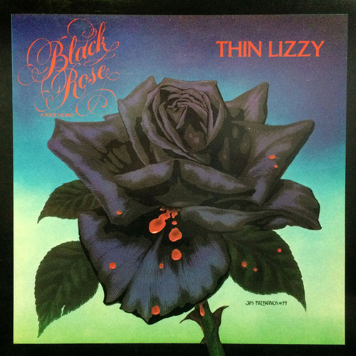
Thin Lizzy – Black Rose: a Rock Legend
(1979, illustrated by Jim Fitzpatrick)
In addition to the multi-part title track, Lynott’s love of Irish poetry (specifically, James Clarence Mangan’s poem “Dark Rosaleen”) directly influenced the cover art of Black Rose: a Rock Legend. Translated from the Gaelic Roísín Dubh (Dark Rose), Fitzpatrick recalled that for the cover “Philip wanted me to try to create, quite literally, a black rose. It was really difficult as I wanted more than just a rose.” Another poem, “(I See His Blood Upon the Rose),” by Irish writer and revolutionary Joseph Mary Plunkett provided the inspiration for the cover’s most noted design feature: blood dripping down the leaves. “Philip was electrified when he saw the final result,” said Fitzpatrick. “He rang me – ‘Jaysus, Jim, you have me sussed! It’s just like I imagined it but better!’”
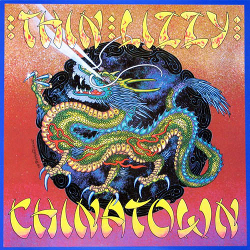
Thin Lizzy – Chinatown
(1980, illustrated by Jim Fitzpatrick)
Fitzpatrick’s final design for a Thin Lizzy album cover is, he said, “one of the most elaborate I ever created for them.” As well as a direct nod to the title track, it is also a not-too veiled reference to the drug use by some members of the band. “I always remember Philip and Scott examining it after I flew over to London with the artwork,” recalled Fitzpatrick. “Philip was delighted, admiring the power of the imagery; Scott had his face right into it, scrutinizing every detail and said ’Jeez, Jim, you’ve painted every fucking scale on that dragon’. That made my day. I was delighted, too, with the final printing – the record company really pulled the stops out.”
Browse Thin Lizzy’s music on limited edition vinyl and CDs here.