Paul McCartney’s Album Covers, Explained
Paul McCartney’s album covers are works of art in their own right. Here are the stories behind them.
Throughout his post-Beatles life, Paul McCartney’s album covers have reflected his passion for the visual arts. Many of his album covers work as standalone artworks (McCartney, NEW, Egypt Station), while others demonstrate his sense of humor (Paul Is Live, Driving Rain). He has enjoyed long-term partnerships throughout his career – his wife, Linda, took a number of the photographs featured (McCartney, RAM, Tug of War, Pipes of Peace) while he used the London-based design agency Hipgnosis for many more (Band on the Run, Venus & Mars, Off the Ground, Back to the Egg). And yet the only thing all of his record covers have in common is that each one is completely original, and nothing like the others.
Here is the story behind some of the best Paul McCartney album covers.
Paul McCartney – McCartney
(1970, photography by Linda McCartney)
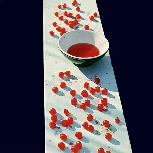
It was a bold way to launch a solo career. Not only did Paul McCartney’s 1970 debut album, McCartney, carry with it a press release effectively announcing the end of the Beatles, but the album featured neither his image nor his name on the front cover. In fact, many fans thought (and still think) that the back cover – which bears the name McCartney alongside a Linda McCartney portrait of her husband and their daughter, Mary, on the family’s Scottish farm – must be the album cover.
But no. People simply had it all the wrong way around. The cover is another of Linda’s shots, this time of cherries laid out on a wall next to a bowl of cherry-red water. The picture is titled “Feeding the birds in Antigua, 1969,” and it’s a striking image full of contrast. The cherries, laid out on top of a wall, create a burst of color against the bleached wall, with the ground below reduced to a solid black.
Paul & Linda McCartney – RAM
(1971, photography by Linda McCartney; artwork by Paul)
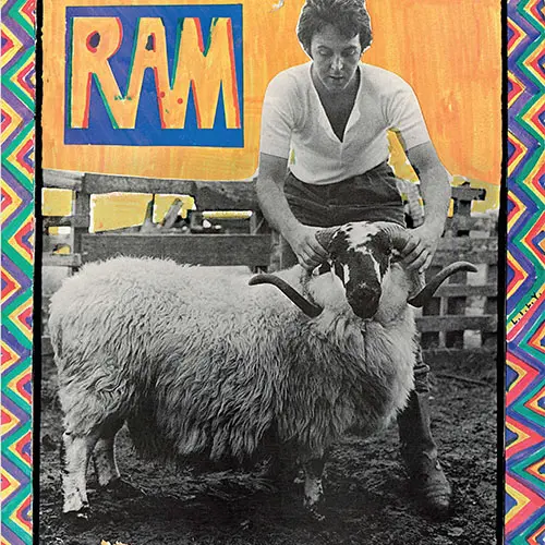
If Paul McCartney’s eponymous debut of the previous year had a homemade quality to it, then RAM, the 1971 album by Paul & Linda McCartney, certainly had a homemade appearance. However, the contents were far more polished, and featured session musicians as well as the McCartneys on what has come to be viewed as one of his best post-Beatles albums.
RAM features a Linda McCartney portrait of Paul with a ram on their Scottish farm, while Paul has doodled a multi-colored, childlike frame with felt-tipped pens. In amongst the rainbow zig-zags, he’s added a message to his wife – the letters L.I.L.Y. apparently standing for Linda, I Love You.
Paul McCartney & Wings – Red Rose Speedway
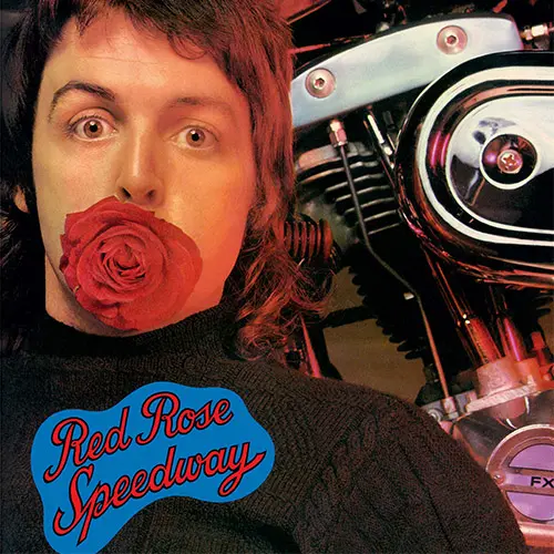
(1973, cover photograph by Linda McCartney; artwork by Eduardo Paolozzi)
The cover art for Wings’ first album of 1973, Red Rose Speedway, was Paul McCartney’s most extravagant package since Beatles albums like Sgt. Pepper and The White Album. It also saw a connection from the early Beatles days come full circle. While the fledgling Beatles honed their craft in the clubs of Hamburg, original bass player and artist Stuart Sutcliffe left the band to remain in Germany and study art under the instruction of Scottish artist and sculptor Eduardo Paolozzi. This created a vacancy on bass, which Paul dutifully took up.
Now, over a decade later, Paul turned to Paolozzi, a pioneer of the pop art movement, to help with the artwork for his new album. The cover photograph itself was taken by Linda McCartney, while the lavish gatefold-plus-12-page-booklet package included Paolozzi’s artwork alongside photos of the band on stage and on their travels. The whole package was finished off with a Braille message to Stevie Wonder on the rear, which said, “We love you, baby!”
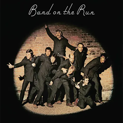
Paul McCartney & Wings – Band on the Run
(1973, photography by Clive Arrowsmith)
Shot by Clive Arrowsmith at Osterley Park, in West London, the cover art for Paul McCartney & Wings’ 1973 Band on the Run album recalled Sgt. Pepper. A band is pictured in front of a barrage of famous faces. Only this time, instead of cut-outs, real celebrities were on hand. “We thought, it’s a band on the run, let’s have a group of people caught in a spotlight, as if they’re trying to escape from jail,” Paul explained. “So, it’s just a group of personalities who all look like they’re prisoners escaping, but when you look a little closer you find James Coburn’s in there, and John Conteh, a boxer from Liverpool…” Christopher Lee, Michael Parkinson, Clement Freud, and Kenny Lynch make up the band, along with Paul, wife Linda, and bandmate Denny Laine.
Arrowsmith recalled that not everything went to plan, however: “I really didn’t know what I was doing and used the wrong film, so the pictures all came out yellow. On top of that, only about three of the shots weren’t blurry from everyone moving about, so when it came to showing Paul I was freaking out too much to say anything – I just held my breath.”
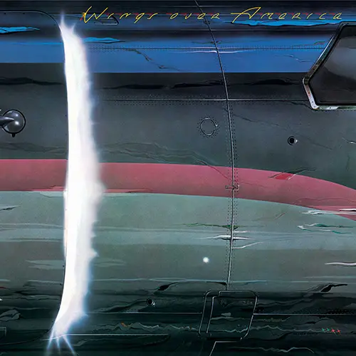
Wings – Wings Over America
(1976, design by Hipgnosis/MPL)
To commemorate Wings’ triumphant world tour, a triple album – Wings Over America – was released in 1976. Perhaps unusually for a live album, the packaging contained no photos from the tour (a painting of a concert adorns the inside gatefold). Instead, Paul turned to Hipgnosis, a London-based design agency that specialized in artwork for more progressive rock acts like Pink Floyd and Genesis. The result was gorgeous, resulting in a Grammy Award nomination for best album package. Painted by Richard Manning, the cover shows an aircraft door opening, a flash of blinding light bursting out from behind the door, suggesting something exciting had just landed.
The photo-real artwork was a painstaking creation – literally. “Just over two thousand rivets were drawn in perspective,” Manning recalled. “[Hipgnosis founder] Storm paid for me to have acupuncture to alleviate an aching neck and shoulder after all that.” One nice touch was how the blinding-light artwork was replicated on the three inner sleeves, with the light getting brighter from side one to side six to identify the playing order of the discs.
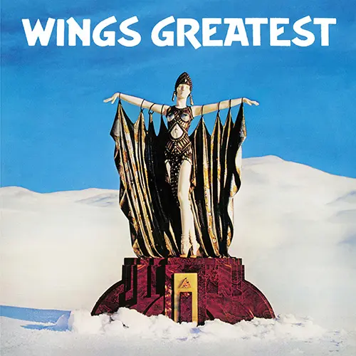
Wings – Wings Greatest
(1978, photograph by Angus Forbes)
Released in 1978, the Wings Greatest compilation featured deceptively expensive cover artwork. When The Beatles had spent almost £3,000 on the cover of Sgt. Pepper, it was obvious where the money had gone, but with Wings Greatest, how many of those who bought it realized the lengths they had gone to in order to get the cover just right?
Designed by Paul and Linda with help from Hipgnosis, the London design studio, the cover featured a photograph of a statuette of a woman, robed arms stretched as wings, in the snow, with a mountainous backdrop. Created by Art Deco sculptor Demetre Chiparus, the statuette in question was rather small (as witnessed when it reappears on a mantelpiece on the cover of Wings’ 1979 Back to the Egg LP). So far, so simple. But the shot was achieved by flying the entire McCartney family to Switzerland, where the statuette was carefully arranged on a mountaintop in the Swiss Alps, before being photographed from a helicopter in flight.
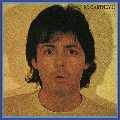
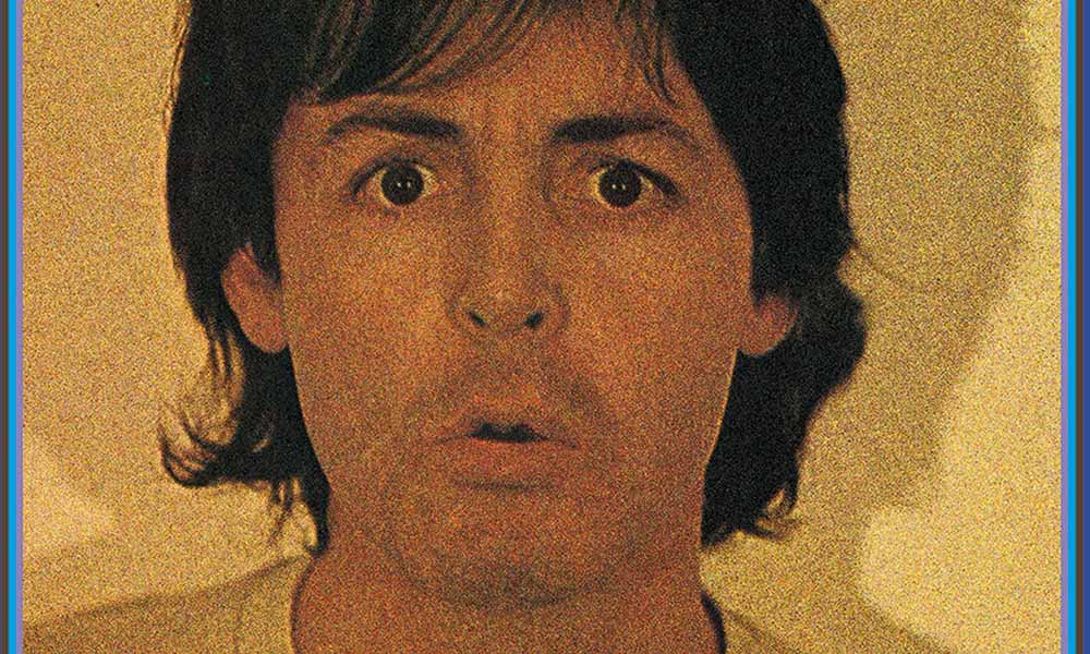
Paul McCartney – McCartney II
(1980, photography by Linda McCartney)
The cover artwork for what was only Paul McCartney’s second solo album features a stark portrait by his wife Linda, in which Paul appears very much the metaphorical rabbit in the headlights. Using lighting from more than one angle, Linda achieves multiple shadows, giving the effect of a mugshot. The promotional artwork for McCartney II featured the photograph beneath the bold legend “On his own”; after spending the 60s as a Beatle, and the 70s with Wings, from here on, Paul was a solo artist.
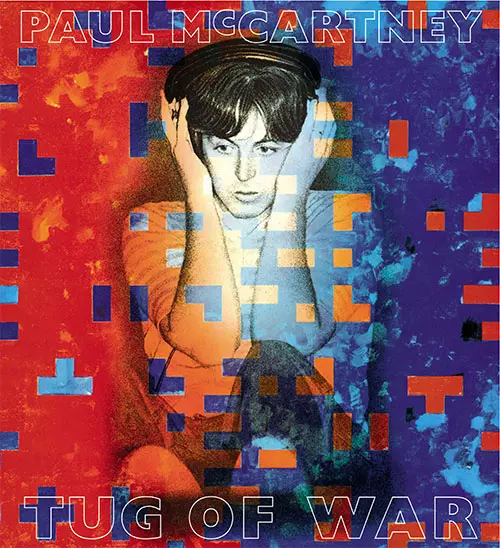
Paul McCartney – Tug of War
(1982, artwork by Brian Clarke; photography by Linda McCartney)
The critics loved Paul McCartney’s 1982 Tug of War album – Rolling Stone magazine called it a “masterpiece.” The striking blue-and-red artwork was a collaboration between Linda McCartney, who took the cover photograph, and the British artist Brian Clarke, known for his work with stained glass and mosaic. Clarke achieved the finished work by using oil paint over a transparency of Linda’s portrait. It would be the first of a number of collaborations between the McCartneys and Clarke, including 1989’s Flowers in the Dirt cover, and an exhibition in 1997.
Seven years later, and after a decade away from the live arena, Paul returned to Brian and his blocky Tug of War concept and commissioned the artist to create the sets for his 1989-90 World Tour, with vast backdrops recalling this album design.
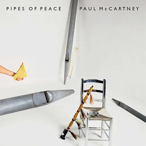
Paul McCartney – Pipes of Peace
(1983, photographed by Linda McCartney)
For the cover art of his 1983 Pipes of Peace album, Paul McCartney mixed the old with the new. Much of this album was written and recorded at the same time as the previous year’s Tug of War LP. As Paul explained, “It was supposed to be the Tug of War album, and then a sort of answer album. So then I thought of the idea of pipes of peace: what would be the opposite of a tug of war? Peace pipes, pipes of peace and stuff. Then I got the idea to play the pipes of peace instead of smoking them.”
Rather unusually, all you see of Paul on the front of the wrap-around gatefold sleeve is his hand, clutching a set of pan pipes. Unfold the artwork, and the 41-year-old is surrounded by a selection of pipes – for both playing and smoking. Central to the front is a chrome sculpture based on the painting “Chair with Pipe” by Vincent van Gogh – entitled, simply, “Van Gogh’s Chair I.” Interestingly, this sculpture, by the pop artist Clive Barker, had first been exhibited in 1966, at the Robert Fraser Gallery in London. Fraser was an old friend of McCartney’s. He introduced Paul to a number of artists, and had even art-directed the cover of Sgt. Pepper’s.
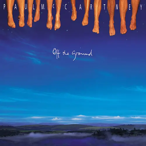
Paul McCartney – Off the Ground
(1993, designed by Hipgnosis; photography by Clive Arrowsmith)
Perhaps Paul McCartney’s most playful album cover, 1993’s Off the Ground features nothing but the band’s feet, disappearing into a clear blue sky above a landscape far below. As Paul explained, “I had an image to go with the Off the Ground title, which was a picture where people accidentally cut heads off whenever they try and take a picture. So I thought, ‘Perhaps we should try and cut the whole thing off and just have feet disappearing off the top of the CD.’ It would just be the band’s feet. That was the image I kept seeing. You can explain it, ‘Well, we didn’t quite get a picture of the band but here is their feet.’”
For the shoot, the band dangled their feet from a bench suspended over a blue screen, and the credits include some old friends. The package was designed by Hipgnosis, who had worked on a number of Wings albums, as well as Tug of War; the photographer was Clive Arrowsmith, whose previous credits include shooting the cover for Band on the Run, 20 years earlier; and, in common with Red Rose Speedway, the album contained a booklet featuring the art of Edinburgh sculptor and artist Eduardo Paolozzi.
Oh, and if you’re wondering, Paul’s are the third pair of feet in from the left, next to his wife Linda’s.
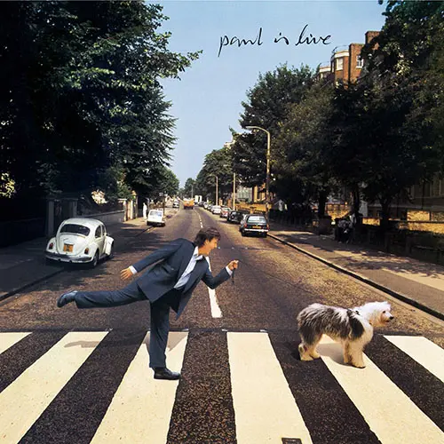
Paul McCartney – Paul Is Live
(1993, Paul photograph by Linda McCartney)
Since the late 60s, fans read clues in Beatles songs and artwork, the most famous of which pointed to Paul supposedly having died in 1966, and been replaced by a doppelganger (who just happened to be a world-class singer and songwriter). As Paul explained, “There had been this rumor, Paul is dead… In 1992, I went back to Abbey Road to record an album; it was a live album, so I called it Paul Is Live.”
For the Paul Is Live artwork, Paul clearly had a lot of fun, superimposing a fresh photo of himself onto an edited version of the cover of Abbey Road. For example, Beatles fans would love that he’s being pulled across Abbey Road by his dog, Arrow, a descendant of Martha (of “Martha, My Dear” fame). Paul is dressed similarly, but this time with his shoes on – on Abbey Road, the fact that he was barefooted was seen as a symbol of his having died. As album covers go, this one is the ultimate “spot the difference” game.
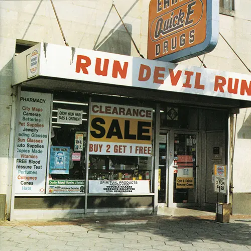
Paul McCartney – Run Devil Run
(1999, photograph by Dave Fine)
Run Devil Run largely comprised covers of old rock’n’roll songs Paul and his recently departed wife Linda had a shared love of. But the title track – and the cover – came to Paul in a moment of divine – or perhaps diabolical – inspiration. “I was in Atlanta with my son and he wanted to visit the funky side of town,” Paul explained. “So we went down there and were just wandering around the block and we came across this sort of voodoo shop selling cures for everything. I was looking in the shop window and I saw this bottle of bath salts called Run Devil Run. I thought that was a good title for a song.”
The album cover features a photo of the shop in question – Miller’s Rexall Drugs – albeit with Miller’s name changed to Earl. Nonetheless, once word got out, Miller quickly turned a buck on the association, with the mom-and-pop reportedly boasting internet sales of over one million within a decade of the album’s release. As for the bath salts? “I’ll be taking a bath with them,” Paul joked. “Not that I have got many demons to get rid of.”
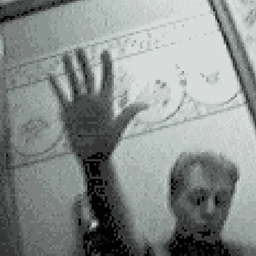
Paul McCartney – Driving Rain
(2001, self-portrait photograph by Paul McCartney)
At first glance, the low-resolution album cover of Paul McCartney’s 2001 Driving Rain appears to show a shadowy McCartney, hand raised as if to block the photographer. This was Paul’s first album of new material since losing wife Linda to cancer in 1998, so it might be understandable that he would want to hide in the shadows.
The photo was taken on a state-of-the-art Casio watch that included a camera. It’s possible that Paul was inspired by his friend Neil Young’s Silver and Gold album the previous year, which featured a pixelated shot Young’s daughter had taken on a Game Boy Camera. Either way, this low-resolution cover is complemented by a selection of Paul’s candid watch snaps throughout the rest of the artwork.
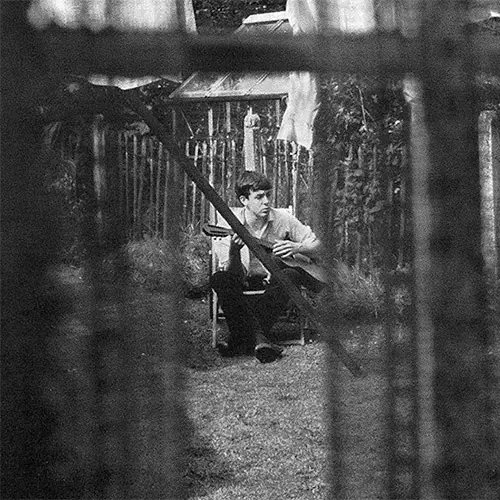
Paul McCartney – Chaos & Creation in the Backyard
(2005, photograph by Mike McCartney)
When it comes to cover artwork, Paul McCartney has never been averse to keeping it in the family. His wife Linda took the cover photos for a number of his albums, while he himself provided artwork for Driving Rain and Egypt Station. For 2005’s Chaos & Creation in the Backyard, however, the striking cover image was taken by Paul’s kid brother, Mike McCartney. Snapped in 1962 through the kitchen window of their childhood home at 20 Forthlin Road, Liverpool, the picture was originally known as “Paul Under Washing,” before being rechristened “Our Kid Through Mum’s Net Curtains.” The photo shows early Beatle Paul on the cusp of global mega-stardom, sat on a deckchair strumming his guitar.
Today, the house is a Grade II listed building, owned and run by the National Trust. In 2018, as part of a Carpool Karaoke TV special with James Corden, Paul returned to the house for the first time since the 1960s, remarking that coming back “just made me realize how long the journey has been – to date.”
Paul McCartney – NEW
(2013, cover image by Ben Ib)
As new album titles go, few are as direct as Paul McCartney’s 16th solo outing, simply named NEW. Reflecting the modern sound (among the album’s four producers are Paul Epworth, who produced Adele’s 21, and Amy Winehouse producer Mark Ronson), the cover artwork is bright, in a very literal sense.
It was inspired by the work of the American minimalist artist Dan Flavin, known for his fluorescent-tube sculptures, and the simple idea was to spell out stylized letters of the word “new” in tube lights. Paul recruited design team Rebecca and Mike, who in turn brought in Ben Ib to bring the concept to life through CGI. “It was a great team to work with under Paul’s guidance,” Ib recalled.
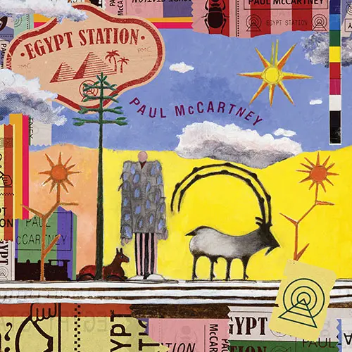
Paul McCartney – Egypt Station
(2018, artwork by Paul)
Paul McCartney’s 2018 Egypt Station was his first solo album to enter the Billboard charts at number one. A critically acclaimed double album, the concept of the artwork and the music itself was intrinsically linked, as Paul told Mojo magazine: “I happened to be thinking about a painting I’d done quite a while ago, called ‘Egypt Station.’ ‘l like those words,’ I thought. Then I saw a picture of the painting and thought, ‘That could be an interesting album cover.’ I’m not gonna do a big picture of me on the front, smiling. I thought this painting might be interesting: it’s crazy enough, and it’s a place. A mystical place…”
The idea began to grow for Paul that the entire album could take place within the station, to which end Sgt. Pepper-esque sound effects open and close the LP to create the station atmosphere. “Once we had the title… we knew what we were going to do, making it all take place, sort of start in the station and then going through with all the songs at different stations and we end up at the destination.”
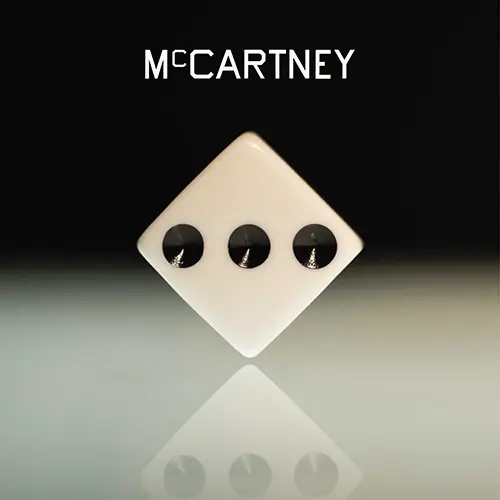
Paul McCartney – McCartney III
(2020, design by Ed Ruscha, photography by Mary McCartney and Sonny McCartney)
The third in an eponymous trilogy spanning his entire solo career to date, McCartney III was, in Paul McCartney’s punning words, “Made in rockdown.” With the COVID-19 pandemic forcing UK residents to stay home, Paul set about recording in the same homemade fashion that had served him on McCartney (1970) and McCartney II (1980). “I was living lockdown life on my farm with my family and I would go to my studio every day,” he explained.
And just as McCartney I & II had featured photography by Linda McCartney, so did Paul again turn to family for this 2020 album, with daughter Mary McCartney taking the lion’s share of the shots used, and Paul’s nephew, Sonny McCartney, also contributing. For the cover art and design, Paul turned to American pop artist Ed Ruscha, who Paul had met through his daughter Stella. Ruscha devised a distinctive dice design, which was rolled out across a series of alternative versions, each in a different color.
Looking for more? Explore the story behind every Beatles album cover here.