The Beatles Album Covers Explained
The group proved that cover art can be so much more than a simple advertisement.
From the very beginning, a big part of The Beatles appeal was visual. In his book The Art of The Beatles, Mike Evans explained, “their image was always unique. Unlike their contemporaries on the music scene, whose style reflected the times, The Beatles invariably helped to establish fashion.” From their pre-fame days, they always had a look – uniform, in every sense. When they first emerged, the press was obsessed with their mop-top haircuts, their matching Cuban-heeled boots, their collarless jackets. How they presented themselves was vital to what made them so… different. And nowhere was this reflected more consistently than on their record covers. Photography, illustration, graphic design – Beatles album covers changed them all.
Before The Beatles, album art was designed to sell the contents – song titles and sales messages on top of the artist’s bright image. But within a few short years, The Beatles album covers were works of art in their own right. Images such as the half-lit heads on With The Beatles, the psychedelic nostalgia of Sgt. Pepper’s Lonely Hearts Club Band, and the simplicity of crossing Abbey Road rank as some of the most influential and enduring art of the 20th century, clearing the way for others like The Rolling Stones, David Bowie, Pink Floyd, and countless others to go even further.
Here are the stories behind some of The Beatles’ iconic album covers.
Looking to build your record collection with vinyl from The Beatles? The Sound Of Vinyl is offering a special discount for all readers that click this link.
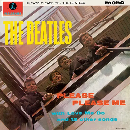
The Beatles – Please Please Me
(1963, cover art photograph by Angus McBean)
The album cover photo introducing The Beatles’ 1963 debut album Please Please Me was shot by Angus McBean. George Martin made the decision. At the time, as well as being the group’s record producer, he was also the head of Parlophone Records. (Martin and McBean had previously already worked on several comedy record covers.) The photo shoot was initially planned for outside the insect house at the London Zoo. The zoo rejected the idea and, eventually, the location of EMI House in London’s Manchester Square was chosen, with a shoot arranged for March 5, 1963. That same day, the group recorded “From Me to You.”
“It was done in an almighty rush, like the music,” recalled Martin. The shot that graced the cover art features the fresh-faced Fab Four grinning down at McBean from a balcony several floors above the lensman: “I only had my ordinary portrait lens, so to get the picture, I had to lie flat on my back in the entrance. I took some shots, and I said, ‘That’ll do.’”
Listen to Please Please Me here.
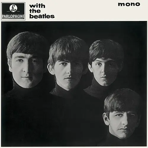
The Beatles – With the Beatles
(1963, cover art photograph by Robert Freeman)
While their first LP was rushed out to capitalize on their initial success, by the time of their follow up, With The Beatles, released on November 22, 1963 (a date that goes down in American history for another reason), it was becoming clear that The Fab Four were no flash-in-the-pan.
Taking inspiration from photos by their friend Astrid Kirchherr, Robert Freeman shot the album cover not in a studio, but the corridor of the Palace Court Hotel, Bournemouth, while The Beatles were on tour. As Paul McCartney recalled, the shoot on August 22, 1963 was “One hour in a hotel. [Freeman] found the end of a corridor, a little window where natural light spilled in at about 11 o’clock. And he just sat us, ‘You sit in front, there…’” The result is a truly iconic image; four young men in matching haircuts and polo-necks, half-lit in black and white, and unsmiling – itself a considerable departure for a pop act. As George Harrison said, “That cover was the beginning of us being actively involved in The Beatles’ artwork.”
Listen to With the Beatles here.
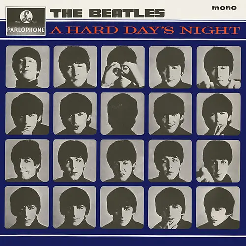
The Beatles – A Hard Day’s Night
(1964, cover art photograph by Robert Freeman)
As with their previous LP, the cover art for 1964’s A Hard Day’s Night (the accompanying album to The Beatles’ first feature film) consists of black and white portraits of each Beatle in matching polo necks and haircuts. Only now they are playing up to the camera, each pulling a series of faces. The 20 portraits (including one of the back of George’s head) were again taken by Robert Freeman, but this time, the shoot took place in the photographer’s London studio.
By now, The Fab Four had become friends with Freeman – he and Lennon lived in the same apartment block. Freeman reflected on that period, commenting, “Being with The Beatles was being in the center of crazy activity, the eye of a hurricane… It was an altogether lively and amusing time.” Designed to look like reels of film, the sleeve design nods to the scene where the individual band members are bombarded by journalists’ questions and photographers’ flashes.
Listen to A Hard Day’s Night here.
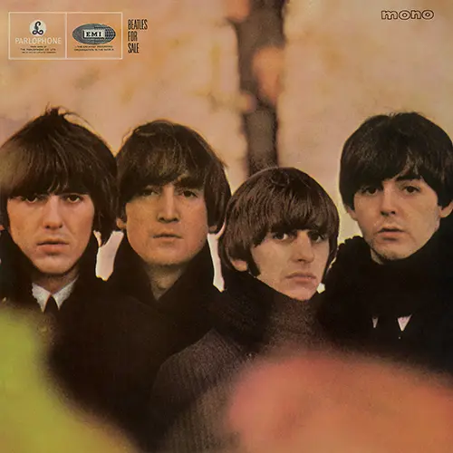
The Beatles – Beatles For Sale
(1964, cover art photograph by Robert Freeman)
Photographed by Robert Freeman in Hyde Park, London, October 1964, the Beatles For Sale album cover shot presents a weary-looking rock ‘n’ roll band, devoid of smiles, and – again – almost identically attired. “The photographer would always be able to say to us, ‘Just show up,’ because we all wore the same kind of gear all the time,” recalled Paul McCartney. “It was easy. We showed up in Hyde Park by the Albert Memorial. I was quite impressed by George’s hair there. He managed to create his little turnip top.”
This was their first gatefold sleeve, and inside is another Freeman portrait, this time of the four Beatles posing in front of a collage of idols from Hollywood and music hall, such as Jayne Mansfield and Victor Mature – a concept they would return to three years later for Sgt. Pepper’s Lonely Hearts Club Band. In his sleeve notes, Derek Taylor wrote “The kids of AD 2000 will draw from the music much the same sense of well-being and warmth as we do today.” And then some, Derek.
Listen to Beatles For Sale here.
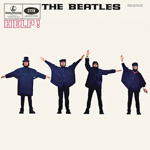
The Beatles – Help!
(1965, cover art photograph by Robert Freeman)
Released to accompany their second motion picture, 1965’s Help! album sleeve shows the Liverpool band reprising their snowsuit outfits from the movie, and seemingly sending a distress signal in semaphore. While photographer Robert Freeman had initially planned to shoot the boys flagging the letters H-E-L-P, he ultimately abandoned this plan, instead preferring an arrangement that worked well graphically. The final album cover actually spells out N-U-J-V (or possibly C).
By 1965, Freeman had become the de facto Beatles official photographer, shooting five of their album covers, as well as a number of their best-loved photo sessions during the Beatlemania years. On his death in November 2019, Paul McCartney said: “He was one of our favourite photographers during The Beatles years, who came up with some of our most iconic album covers. Besides being a great professional, he was imaginative and a true original thinker.”
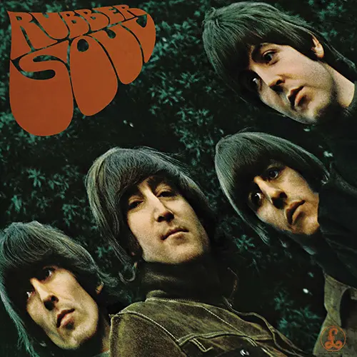
The Beatles – Rubber Soul
(1965, cover art photograph by Robert Freeman)
The Beatles’ second album of 1965 was their biggest departure to date music-wise, with songs like “Nowhere Man” and “Norwegian Wood.” The cover art reflected that experimentation. For starters, the album art didn’t feature the band’s name, just their four faces, peering distorted at the listener beneath the title, Rubber Soul. “It was Paul’s title,” John Lennon said. “It was like ‘Yer Blues’, I suppose, meaning English soul, ‘Rubber soul’. Just a pun.” The typography was, as with so many Beatles things, just ahead of its time; within a year, that style would be de rigueur on psychedelic poster art.
The stretched effect came about purely by accident. “The photographer Robert Freeman had taken some pictures round at John’s house in Weybridge,” Paul McCartney explained. Back in London, Freeman presented the pictures projected onto an album-sized piece of card. “We had just chosen the photograph when the card that the picture was projected onto fell backwards a little, elongating the photograph. It was stretched and we went, ‘That’s it, Rubber So-o-oul, hey hey! Can you do it like that?’ And he said, ‘Well, yeah. I can print it that way.’ And that was it.”
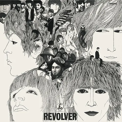
The Beatles – Revolver
(1966, illustrated by Klaus Voormann)
Having designed The Beatles’ previous five vinyl record covers, Robert Freeman had created a proposed photo collage design for 1966’s Revolver. However, this was rejected in favor of an illustration by an old friend from Hamburg, Klaus Voormann. Perhaps inspired by illustrator Aubrey Beardsley, an exhibition of whose line drawings had drawn huge crowds to London’s V&A Museum in the summer of 1966 (Beardsley would appear on the cover of Sgt. Pepper’s Lonely Hearts Club Band), the album cover featured line drawings of The Beatles alongside cut-up photos.
Voormann told Mojo’s Martin O’Gorman: “Because they were being so avant-garde, I thought the cover has to do the same thing. I wanted to push the design further than normal.” When Voormann presented his finished cover art to The Fab Four, along with producer George Martin and manager Brian Epstein, he was at first met with silence. But it soon became clear that they loved it. Epstein told Voormann: “Klaus, this is exactly what we needed. I was worried that this whole thing might not work, but now I know that this cover, this LP, will work – thank you.”
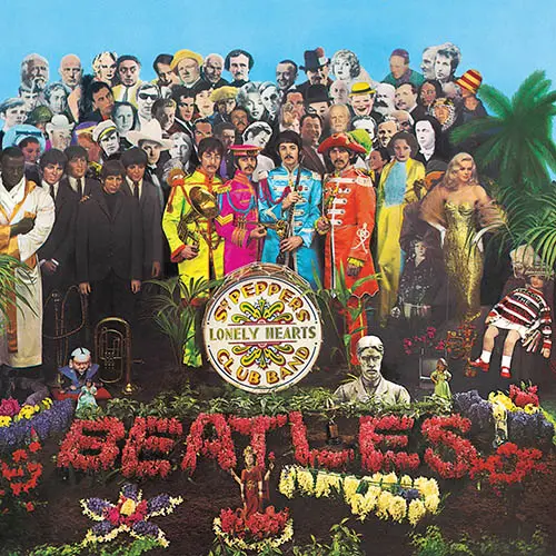
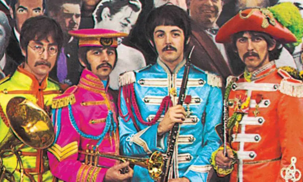
The Beatles – Sgt. Pepper’s Lonely Hearts Club Band
(1967, designed by Peter Blake and Jann Haworth; cover art photograph by Michael Cooper)
Sgt. Pepper’s Lonely Hearts Club Band in 1967 was perhaps more nostalgic than psychedelic, as the uniformed Beatles fronted a montage of over 60 life-size photographs representing friends, heroes, and icons, alongside waxworks of their Mop Top selves. “We wanted the whole of Pepper to be so that you could look at the front cover for years,” Paul McCartney explained, “and study all those people and read all the words on the back.”
The Beatles called upon artist Peter Blake and Jann Haworth to pull it all together. The most celebrated album cover ever made was a revolution in design, and saw the packaging itself raised up to the level of art; specifically pop art. As Ringo Starr remembered, “Sgt. Pepper was a special album, so when the time came for the sleeve we wanted to dress up, and we wanted to be these people, all the ‘Peppers’. It was Flower Power coming into its fullest. It was love and peace; it was a fabulous period, for me and the world.”
Listen to Sgt. Pepper’s Lonely Hearts Club Band here.
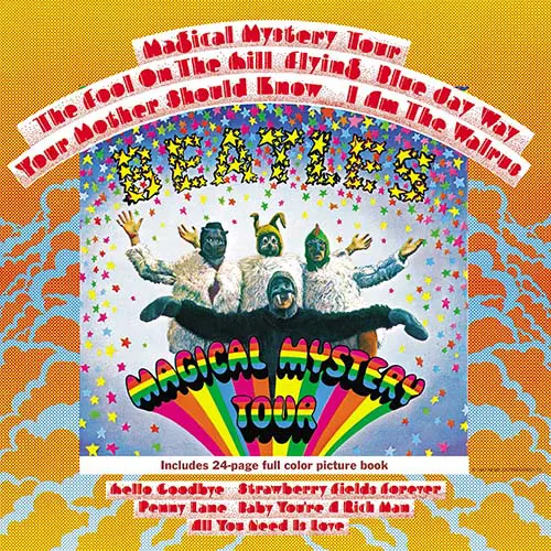
The Beatles – Magical Mystery Tour
(1967, designed by John Van Hamersveld)
Although not originally released as an LP in the UK, where instead a double EP plus booklet accompanied the made-for-TV movie, the 1967 US Magical Mystery Tour album has become the only US release to have become a de facto part of their catalog. The cover art shows the group in their I Am the Walrus outfits from the film (in which, contrary to what John Lennon wrote in “Glass Onion,” the Walrus was John; Paul was the hippo). It was the first album cover by The Beatles where the group member’s faces didn’t appear at all.
For the song “I Am the Walrus,” John had taken his inspiration from Lewis Carroll’s poem “The Walrus and the Carpenter.” “It never dawned on me that Lewis Carroll was commenting on the capitalist and social system,” John told Playboy in 1980. “Later, I went back and looked at it and realized that the walrus was the bad guy in the story and the carpenter was the good guy. I thought, ‘Oh, shit, I picked the wrong guy’. I should have said, ‘I am the carpenter’. But that wouldn’t have been the same, would it? (singing) ‘I am the carpenter…’”
Listen to Magical Mystery Tour here.
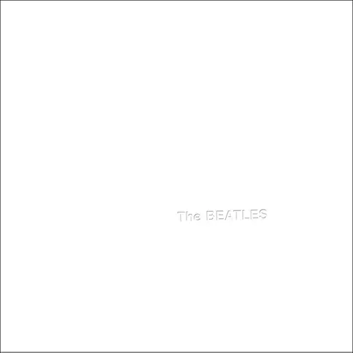
The Beatles – The Beatles (The White Album)
(1968, designed by Richard Hamilton)
In many ways, the cover art of The Beatles – known to all as The White Album – was the exact opposite of its predecessor, Sgt. Pepper’s Lonely Hearts Club Band. Where Pepper was busy and vibrant, 1968’s White Album was, well, white. But as with Pepper, they turned to an established artist to bring their ideas to fruition. Enter Richard Hamilton, one of the pioneers of pop art. As Hamilton recalled, “Paul McCartney requested the design be as stark a contrast to Sgt. Pepper’s day-glo explosion as possible… he got it!”
The package also included four portraits taken by John Kelly, as well as a collage poster created by Hamilton, with Paul acting as his assistant. “For me, that was a great lesson that I was getting from the hands of someone like Richard Hamilton,” said Paul, “a whole week of his thoughts. No mean teacher, man!” To continue the artistic theme, initial copies were given individual numbers, resembling editions of limited-run artworks or poetry books. In 2015, Ringo Starr’s personal copy, numbered 0000001, became the world’s most expensive record, when it sold at auction for $790,000.
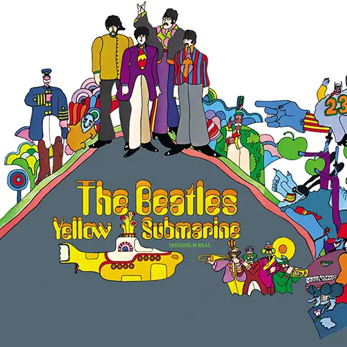
The Beatles – Yellow Submarine
(1969, director George Dunning and illustrator Heinz Edelmann)
The soundtrack album to the 1968 animated movie Yellow Submarine is unique among Beatles albums, in that only one side of the record contains any Beatles music – side two features George Martin’s orchestral score for the film. There are, in fact, just four new Beatles songs on the entire LP.
By the time the soundtrack album was released in January 1969 (while The White Album was still at number one, and as the group began their Get Back project), their psychedelic alter-egos, as imagined by illustrator Heinz Edelmann, were so far from their current look as to make the movie appear nostalgic. Despite not being of The Beatles’ creation, the Yellow Submarine artwork remains iconic today, and adorns everything from notebooks and tote bags to playing cards and socks – there’s even a Yellow Submarine edition of Monopoly. “I loved Yellow Submarine,” Ringo Starr recalled. “I thought it was really innovative, with great animation. The Sea of Holes, the Blue Meanie syndrome – it’s still great and I’m glad we were involved with it.”
Listen to Yellow Submarine here.
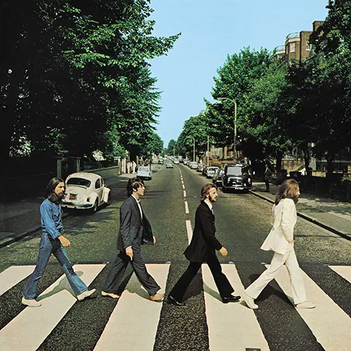
The Beatles – Abbey Road
(1969, cover art photograph by Iain Macmillan)
Finished up over the summer of 1969, Abbey Road was the last album recorded by The Beatles, and the working title of Everest (after engineer Geoff Emerick’s brand of cigarettes) suggested a cover shot of the group in front – or even on top – of the world’s highest peak. But when that idea was scuttled, they settled on doing almost the exact opposite; popping out the studio’s front door and naming the album Abbey Road, after the street where EMI’s studios were located.
The shoot took place on the morning of August 8, 1969, and created the most famous zebra crossing in the world. With rumors that Paul McCartney had died and been replaced by a look-a-like, fans scoured the new artwork for clues. Some thought that Paul being barefoot was a sign. John Lennon later dismissed that idea: “Paul walked barefoot across the road because Paul’s idea of being different is to look almost straight, but just have his ear painted blue – something a little subtle. So Paul decided to be barefoot that day walking across the road.”
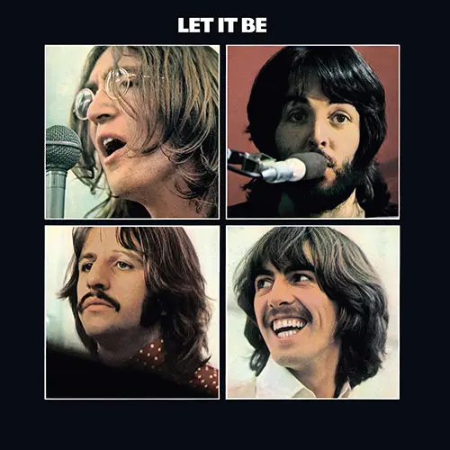
The Beatles – Let It Be
(1970, cover art photograph by Ethan Russell)
Although not the last album The Beatles would record, by the time Let It Be was finally edited together for release in 1970, this rock band was already part of history. Initial copies in certain territories were issued as part of a lavish box set, which included a luxurious book of Ethan Russell’s photographs. On the album cover, the four Beatles are presented simply against a black background, each shot individually and within his own box.
But that hadn’t always been the plan. The original idea was for the record to be called Get Back, with a sleeve mimicking that of their debut, Please Please Me. Photographer Angus McBean was recalled to copy his 1963 shot – at great expense. However, why this idea was ultimately rejected appears to have been lost in the mists of time. Indeed, in a 1971 open letter to Paul McCartney in Melody Maker, John Lennon asked, “By the way, what happened to my idea of putting the parody of our first album cover on the Let It Be cover?”
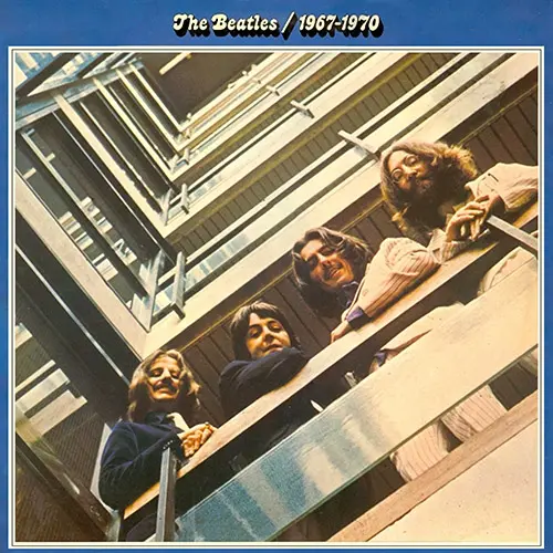
The Beatles – Red & Blue
(1973, cover art photograph by Angus McBean)
The idea had been for The Beatles’ shelved 1969 Get Back LP to mimic their 1963 debut, Please Please Me. As it was, the public had to wait until the two volumes of what became known as the Red and Blue albums were released in 1973 to enjoy the dramatic comparison of the group pictured in the same spot, just six years apart.
Angus McBean took charge of both shoots at EMI’s Manchester Square HQ. But the second shoot proved trickier than the first. An initial attempt had to be aborted as a new porch had been built in the intervening years, preventing McBean from taking up his original position. With the porch removed, they completed the shot a week or so later.
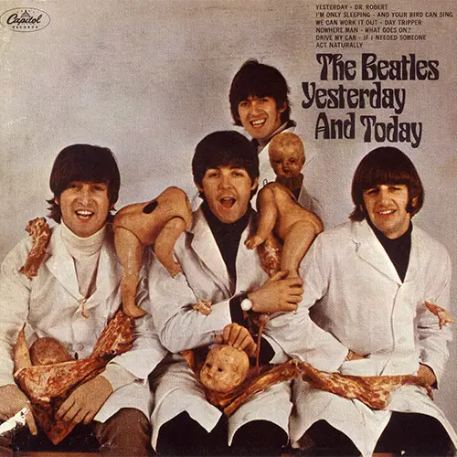
The Beatles – Yesterday & Today
(1966, cover art photograph by Robert Whitaker)
One of the most sought-after Beatles album covers, the infamous ‘Butcher cover’ of their June 1966 Yesterday and Today LP in the United States was a piece of conceptual art, taken by British photographer Robert Whitaker. For the shoot, the four Beatles were dressed in butchers’ jackets and draped with hunks of meat and broken parts of baby dolls. “My original idea for the cover was better,” John Lennon insisted: “Decapitate Paul. But he wouldn’t go along with it.”
As soon as the first copies of the US versions were sent out, however, the shocked reaction to the Butcher cover made Capitol Records recall the album. Their solution? Paste a new picture over the top of the old one. As Ringo Starr recalled in Anthology, “The sleeve was great for us because we were quite a nice bunch of boys and we thought, ‘Let’s do something like this!’ What was crazy about that sleeve was that, because it was banned, they glued paper over it and everyone started steaming it off. They made it into a really heavy collector’s item.” Today, copies change hands for – at least – four-figure sums.
Listen to the album here.
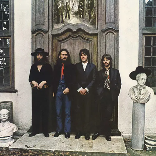
The Beatles – Hey Jude
(1970, cover art photograph by Ethan Russell)
It was likely the last time the four Beatles would all be together for a photo session. But, as Ringo Starr explained in Anthology, that was never meant to be the case. “It was just a photo session. I wasn’t there thinking ‘This is the last photo session’.” The resulting photographs included one selected to adorn their 1970 US compilation album, Hey Jude. Taken by Ethan Russell, the shoot took place at John and Yoko’s recently purchased Tittenhurst Park mansion just outside Ascot, in Surrey, on August 22, 1969.
The album cover portrait was taken in front of the estate’s Victorian Assembly Hall, the four Beatles dressed with little of the color seen on Sgt. Pepper’s Lonely Hearts Club Band. And yet despite the darkness, there is plenty of light to be found – George’s hat perched atop a Victorian bust, for example, while it’s easy to believe from the expressions on their faces that George and Paul are sharing a wry moment.
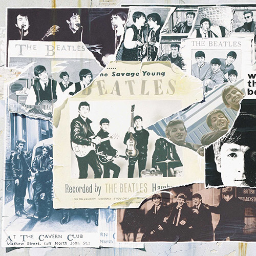
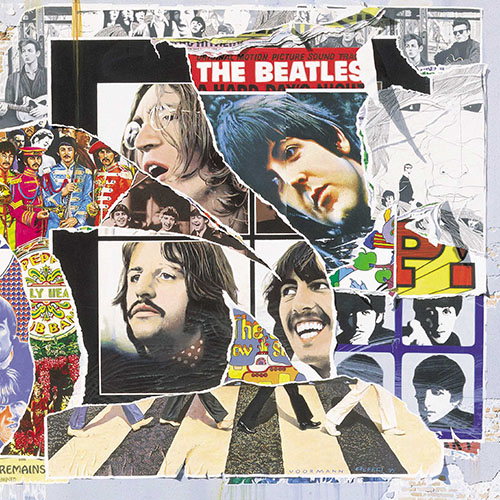
The Beatles – Anthology vols 1-3
(1995, illustration by Klaus Voormann)
The artwork that accompanied Anthology, The Beatles’ 1995 telling of their own story, was illustrated by Klaus Voormann, a friend from their pre-fame Hamburg days, who had played bass on a number of their solo recordings – including John Lennon’s Imagine and George Harrison’s All Things Must Pass – and had previously illustrated the cover for their 1966 Revolver LP. When placed side by side, the three volumes of Anthology make up one long collage.
Hidden in Voormann’s illustration are a number of ‘easter eggs’ for fans to enjoy. On the artwork for volume 1, for example, the artwork from an unofficial album The Savage Young Beatles sees the head of original drummer Pete Best torn off, allowing his replacement, Ringo Starr, to peer through. As a wry nod to this, Best later used the missing section as the cover of his 2008 album, Haymans Green. Another, even less-obvious gem related to Voormann’s Revolver sleeve. On the 1966 cover, Voormann hid a small snap of himself aged 28 within the artwork. For the 1995 artwork, Voormann hid a photo of his 57-year-old self in the re-drawn album cover.
Capitol Records Albums in the United States
The Beatles’ US LPs were markedly different to those issued in the UK. Early mixes, rough edits, and a thorough drenching in echo meant that – until the UK versions superseded them on CD in the 1980s – Beatles fans stateside were hearing something quite different from what The Beatles were producing. With the notable exception of Yesterday & Today (1966), The Beatles had very little to do with the artwork on US albums like Meet The Beatles. Indeed, the album art often boasted sales messages on the cover – “Electrifying big-beat performances by England’s Paul McCartney, John Lennon, George Harrison, and Ringo Starr” hollered The Beatles Second Album, while Beatles ’65 boasted “Great new hits by John • Paul • George • Ringo.”
Browse The Beatles’ music on limited edition vinyl and CDs here.