Can You Judge An Album By Its Cover? How Artwork Reflects The Music
In the vinyl era, every genre of music developed its own visual aesthetic, a tip-off to the listener as to what could be found inside the album cover.

Back in 1984 and ’85, Joe Jackson released a pair of career-defining albums, Night And Day and Body And Soul. Without even buying the records, his fans knew that these wouldn’t sound like the punchy new wave rock he’d become known for. Both of them looked more like jazz albums – in fact, the latter looked like a specific jazz album, with Jackson recreating the moody pose of Sonny Rollins with sax and cigarette on Vol.2. On Night And Day you had a New York skyline, a cartoon Jackson in deep thought at his piano, and another obvious homage, to New York line drawing master Abe Hirshfeld. Both albums were big steps for Jackson, who’d released I’m The Man, just a two years earlier. But when fans saw the album cover, they pretty much knew what they were in for.
Particularly in the vinyl era, every genre of music developed its own visual aesthetic, a tip-off to the listener as to what could be found inside the package. There were, of course, plenty of diversions, and many stylistic take-offs as well, such as The Replacements’ Hootenanny, which went out of its way to look like a bargain-bin country album.
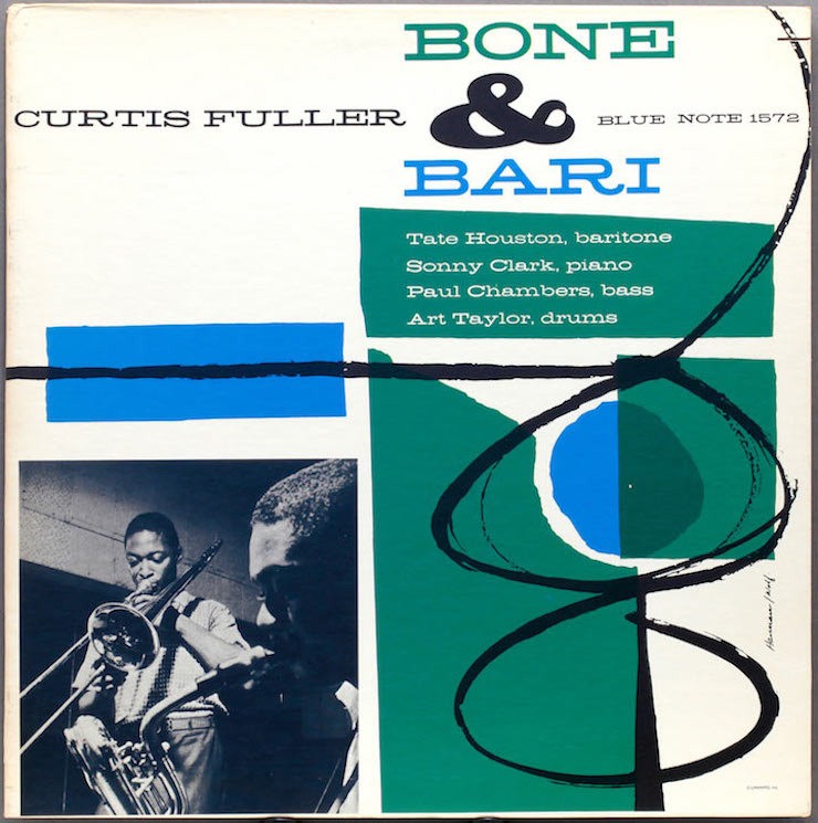
The look of jazz was partly defined by those Prestige and Blue Note covers from the late 50s and early 60s, with their pop-art graphics and slightly mythic photos of the musicians, usually seen in shadow or in serious thought (or both, as on the Sonny Rollins sleeve). As the 70s went on, jazz albums began to look more like rock albums (you might take Miles Davis’ wild Bitches Brew as the turning point), but the ECM label came along with a different aesthetic of its own. Looking at its sleeves (notably on Pat Metheny’s first half-dozen albums), you could recognize a label in search of higher beauty.
Bachelor-pad cheesecake never had a finer hour than the easy listening albums of the mid-60s, usually featuring models in some kind of come-hither pose – mostly soft and romantic, though there was one string of thrift-shop albums with pin-up model Bettie Page tied up in a jungle that looked suspiciously like somebody’s suburban backyard. The classic of the genre is, of course, Herb Alpert & the Tijuana Brass’ Whipped Cream & Other Delights, whose cover model appeared to be covered in nothing but frosting. That, alas, was one myth that got shattered by the CD era. When the cover was reproduced in hi-res on the 90s reissue, it became pretty clear that she had a white wedding dress on underneath.
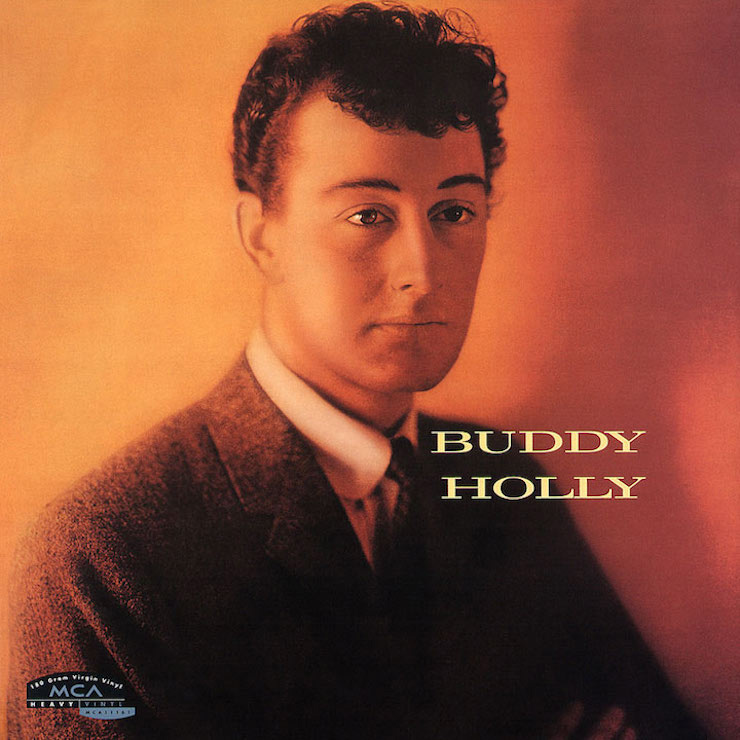
Pre-Beatles rock was as wholesome as it gets. Usually, there’d be a grinning photo of the band, with some garish DayGlo pastel background, and even that would be dwarfed by a listing of the song titles – always prominently displayed on the front cover. But give a hand to Buddy Holly, who was ahead of his time in any number of ways. The cover of his 1958 self-titled, solo debut had a gawky, unflattering photo of Buddy set in somber sepia tones, the serious effect of which was quite different from the music (‘Peggy Sue’ was track two). It looks remarkably like an alt.country album from the present day – and arguably sounds like one too.
Meanwhile, in the world of prog rock, the visual direction can be summed up in two words: Roger Dean. Prog rock was supposed to emanate from a different world, and Dean’s work – most famously for Yes – showed you what that world looked like. With its floating landscapes and fanciful creatures (like the strangely human snake on Yes’ Relayer, or the five-armed wizard on Greenslade’s Beside Manners Are Extra, sometimes the artwork was more famous than the album itself.
If a prog cover wasn’t one of Dean’s then it was probably created by Hipgnosis, the English design company who gave us such visions as Peter Gabriel’s melting face, Pink Floyd’s airborne pig, Led Zeppelin’s naked children, and Genesis’ surreal The Lamb Lies Down On Broadway triptych. Interestingly, one of the later partners in Hipgnosis was Peter Christopherson, whose own music was a long way from prog. He was part of sonic terrorists Throbbing Gristle.

When it came to singer-songwriters, James Taylor threw down the gauntlet for a couple of generations with the cover of Sweet Baby James. Just try to look more thoughtful, slightly tortured, and deeply sensitive – yet highly shaggable – at the same time. Plenty of artists from both genders tried to top it – and from the faces staring out of albums like Ryan Adams’ Heartbreaker and Ed Sheeran’s 2011, it looks like they’re still trying.
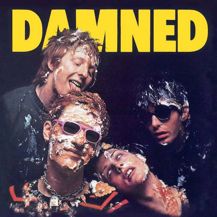
Punk’s initial contribution to album artworks was some of the least flattering, crankiest-looking artist photographs in history. See The Jam’s In The City, the back of Wire’s Pink Flag and, most spectacularly, The Damned’s self-titled debut. Johnny Ramone (on his band’s debut) even revived the noble tradition, last seen on Moby Grape’s debut, of flipping the bird at the photographer. But a lot of punks had been to art school, so one of the most iconic images is still the ransom-note design of the Sex Pistols’ Never Mind The Bollocks… Here’s The Sex Pistols. What could be more punk that looking threatening and cheap at the same time?
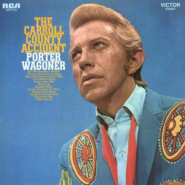
By and large, country music has stayed true to its visual traditions of cowboy hats and wide-open spaces. You can still find both on a fairly recent album such as Jason Aldean’s They Don’t Know and Lucinda Williams’ West. But let’s not forget that vintage country also gave us some of the strangest covers in history, like The Louvin Brothers’ now-iconic Satan Is Real and Porter Wagoner’s slice-of-cheating life on The Cold Hard Facts Of Life. Not to mention the cover of his Rubber Room album. If the song wasn’t unsettling enough, Waggoner here looks remarkably like David Lynch’s Eraserhead.
Soul music also bore a unique visual signature. For a quick history lesson, just check Motown’s 60s artworks and see how the images changed during the decade of the Civil Rights movement. The early 60s covers were old-fashioned and very showy, as with the grinning and white-tuxedoed Smokey Robinson and company on the cover of Hi, We’re The Miracles.
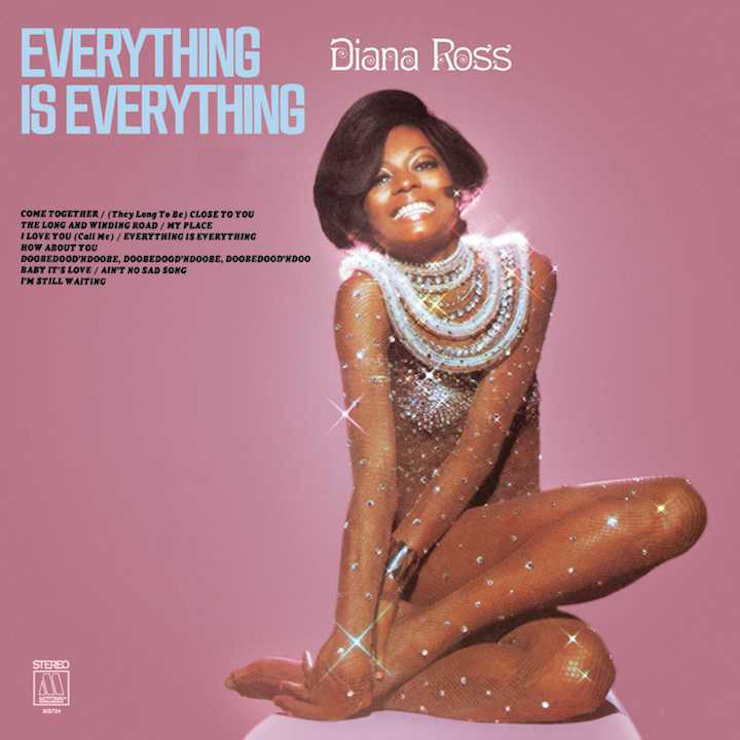
By 1965 you had the three Supremes dancing joyfully on the cover of The Supremes A’ Go-Go, looking like they were shaking all the old stereotypes loose. And by decade’s end, the artists are celebrated in all their power: you have a sage Marvin Gaye on What’s Going On, a regal and glittering Diana Ross on Everything Is Everything, a shamanic Stevie Wonder on Music Of My Mind. And Motown still loved the occasional high concept, like turning The Temptations into Legionnaires on I Wish It Would Rain.
Just like the music, hip-hop artwork has seen a few transformations over the decades. The early Sugar Hill albums had a quick-shot K-Tel records look, befitting a time when rap was still a singles medium. During the heyday of N.W.A. and Ice-T, it was the toughest cover shots that got the most attention, but there were plenty of antidotes to that as well, with De La Soul appropriating flower power and Digital Underground borrowing George Clinton’s cartoon aesthetic. And, despite the advent of streaming, hip-hop cover art continues to be a big part of projects: From iconic Drake record covers to inventive Young Thug album sleeves, it’s clear that the artwork remains an integral part of any release.
Looking for more? Discover the 13 most iconic album cover designers.