The Visual History Behind The Greatest Prog Rock Album Covers
Few kinds of music are more inherently visual than prog rock, which is why prog-rock album covers are an art form on their own.

Few kinds of music are more inherently visual than progressive rock. The music lends itself to elaborate flights of fantasy, which is why prog rock album covers are an art form on their own. To this day, it’s impossible to think of prog music without imagining the manic Schizoid Man, ELP’s mummified goddess, or your favorite Roger Dean fantasy kingdom. In some cases, like Hugh Syme’s work with Rush, Dean’s with Yes, or Kim Poor’s with Steve Hackett, the cover art was the ongoing visual translation of themes in the music.
The likes of Dean, Paul Whitehead, and the Hipgnosis team also worked in other musical genres, but it was largely their prog-related albums that made them household names. Many of the best prog rock album covers become iconic as the albums themselves; along with a few visual masterstrokes that adorn the covers of less celebrated albums.
Here are the stories behind some of the greatest prog rock album covers.
Camel – Mirage
(1974, Illustrated by Phil Smee)
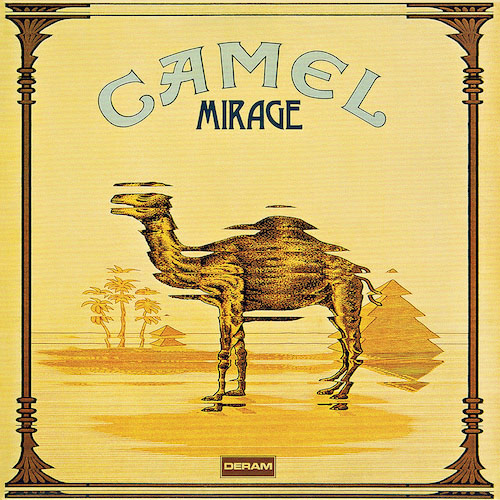
There was no way the original cover for Camel’s 1974 Mirage album was ever going to fly in America. The album’s original jacket was designed after the Camel cigarettes package by artist Phil Smee (of Motörhead logo fame) but rendered out of focus, as to resemble a mirage. Stateside, the cigarette folks threatened to sue, so the U.S. label came up with a cartoon camel on the moon as a quick substitute. At home in the U.K., the response was quite different. The European cigarette company loved the cover and released album-themed packs as a tie-in. They even suggested that the band rename some of its instrumentals to reinforce the connection. Trouble was, not everyone in the band smoked, so when keyboardist Peter Bardens proposed a track called “Twenty Sticks of Cancer,” that was the end of that.
Gong – Gazeuse!
(1975, Illustrated by Jacques Moitoret)
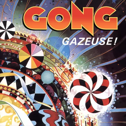
Gazeuse! was an important transitional album for Gong, who’d lost visionary leader Daevid Allen an album earlier and were now dispensing with vocals altogether. The new sound was steeped in hipster jazz, so in Europe, the 1975 album was given a lively, pop-art cover by artist Jacques Moitoret that harked back to the hippest corners of the early 60s. It also tied in with the European title, which literally meant “fizzy!” but likely had a colloquial meaning as well (It’s a gas!). The Seattle native Moitoret created similar surrealist designs for Helix, Seattle’s first “underground” newspaper in the 60s. In America, the album was renamed Expresso and given an alternate cover designed by John Thompson that was equally whimsical but lacked the colorful pop-art elements.
Renaissance – Scheherazade & Other Stories
(1975, Illustrated by Hipgnosis)
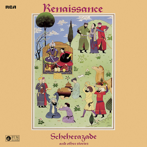
The Hipgnosis team may have made its name with outlandish visions, but they could do something simple and lovely when an album called for it. Renaissance’s classic 1975 album Scheherazade & Other Stories was given an appropriate storybook-like cover, showing some of the characters that sprang from its heroine’s imagination. Though the effect is pretty, there’s also a bit of stylized violence – she was marrying a bloodthirsty sultan after all. The theme was carried over nicely on the band’s next album, Live at Carnegie Hall, where the sultan and Scheherazade are attending the show.
Mike Oldfield – Tubular Bells
(1973, Illustrated by Trevor Key)

The album cover for Mike Oldfield’s 1973 debut album Tubular Bells is one of those cases where the simplest image was the most iconic one. Trevor Key’s cover shows the bells floating above a seascape, like the music itself, it calls for your imagination to add whatever it likes. It also gave Oldfield an image to return to for most of his career: The bells would reappear in his many sequel albums. On The Millennium Bell, they were literally the center of the universe. The stormy seascapes would also come to reflect Oldfield’s state of mind, as the reflective shot in the cover of Incantations.
Nektar – A Tab in the Ocean
(1972, Illustrated by Helmut Wenske)
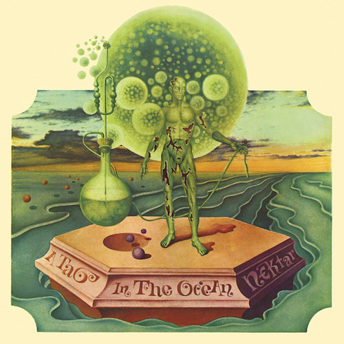
There was always a thin line between prog and psychedelia, especially on this early, 1972 Nektar disc; but the cover for A Tab in the Ocean was full-on psych. German artist Helmut Wenske gave a visual answer to a question that was on the band’s mind at the time: What would happen if someone dropped a tab of acid into the Atlantic Ocean? As envisioned here, the answer is that a majestic spaceman-like creature would rise from the water, with an orb at his head and a test tube by his side, ready to work his magic on the world. In reality, of course, the tab would probably just dissolve, and nobody would get high, but who needs reality anyway?
Rush – Permanent Waves
(1980, Illustrated by Hugh Syme)
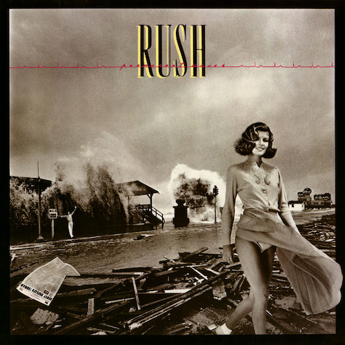
Rush’s visual style really blossomed with the cover of their 1980 album, Permanent Waves, which shifted from the sci-fi themes of earlier albums to more complex and surreal ideas. While the album title was partly Rush’s response to the New Wave movement, designer Hugh Syme went for the phrase’s other meanings. He also reflected the pressure the band was under by showing a 50s-style model (an homage to Donna Reed and her trademark hairdo) walking away from a hurricane. As usual, there were a few hidden jokes, including Syme himself waving to the viewer.
Rick Wakeman – The Six Wives of Henry VIII
(1973, Art Directed by Michael Doud)
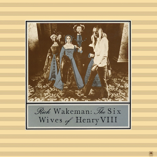
Rick Wakeman’s album covers would get bigger and splashier as his concept albums did, but the cover of his 1973 solo debut The Six Wives of Henry VIII was more subtle. With a photograph of a serious-looking Wakeman walking among the figures of Henry VII and his wives at Madame Tussaud’s wax museum, it underlined the historical nature of the album. Everything about the cover was quintessentially English. Except of course for Richard Nixon, who’s there in the background if you look closely; the Tussaud’s folks had failed to move his figure all the way out of range.
Genesis – Foxtrot
(1972, Illustrated by Paul Whitehead)
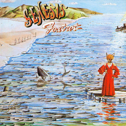
Charisma Records staff artist Paul Whitehead was right in tune with the slightly sinister fantasy sensibility of early Genesis. His cover for their 1972 album Foxtrot worked off the apocalyptic theme of the album’s epic “Supper’s Ready,” but it was Whitehead’s idea to make the theme a little more fanciful, hence the red-dressed woman with the fox head, which was also inspired by Jimi Hendrix’s “Foxy Lady.” Whitehead even came up with the album’s title to tie in with the painting he’d done. And if you look closely, the croquet scene from the previous album Nursery Cryme can be seen on the back, another classic prog rock album cover.
Van der Graaf Generator – Pawn Hearts
(1971, Illustrated by Paul Whitehead)

Paul Whitehead strikes again, with an even more outlandish vision. For Van der Graaf Generator’s 1971 album Pawn Hearts, he worked off the basic idea of the album title – that everybody is a pawn in a cosmic chess game – however lofty their position in life. So he designed a chessboard hovering above the earth, populated by all sorts of figures: Jesus, Shakespeare, and Napoleon are all there, along with an alien figure that was inspired by the Mekon (not the later punk/roots band, but a character in the U.K. comic strip Dan Dare). Alien life and chess were two of the many interests shared by Whitehead and Van der Graaf Generator’s Peter Hammill, and Whitehead came up with a matching cover for Hammill’s solo debut Fool’s Mate.
Gentle Giant – Civilian
(1980, Designed by Nancy Donald and Ginger Canzoneri)
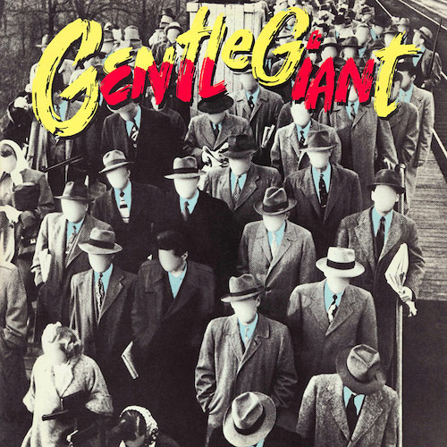
There was a nice bit of serendipity about the cover of Civilian, Gentle Giant’s 1980 LP. The album didn’t have a title when it was produced, so Gentle Giant’s name was painted with some red shading toward the bottom, which inadvertently spelled out the word. Reportedly, the band saw the cover and wondered who “Civil Ian” was. But coupled with the image of a faceless crowd, it ties in with the album’s concept about a 1984-type world as seen through an everyday civilian. And here’s the real eyebrow-raiser, co-designer Ginger Canzoneri (who also did Gentle Giant’s live album Playing the Fool) would soon become renowned for her other gig, managing the Go-Go’s.
Triumvirat – Spartacus
(1975, Art directed by Roman Rybnikar)
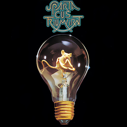
This 1975 Triumvirat album cover was a bit of a surprise, but a memorable one. Spartacus was a true concept album, but the cover didn’t relate to the concept. Instead, Triumvirat’s art director Roman Rybnikar carried over the band’s white-rat mascot, which first appeared on their previous album Illusions on a Double Dimple. This time the rat was placed inside a light bulb, appearing to pull a lever, that was meant to show the band was a wellspring of ideas.
Steve Hackett – Voyage of the Acolyte
(1975, Illustrated by Kim Poor)
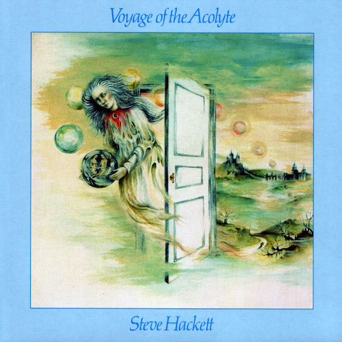
Things didn’t end well between Steve Hackett and Brazilian artist Kim Poor, who was his longtime album art designer as well as his wife for 32 years. But Poor’s designs were a crucial part of Hackett’s landmark albums, illuminating the otherworldly nature of his music. One of her most beautiful prog rock album covers, Voyage of the Acolyte, was done when both partners were turning to the Tarot deck and their own relationship for inspiration. The cover’s theme draws from two of the song titles – “Hands of the Priestess” and “The Lovers ” – underscoring the romantic nature of Hackett’s music.
The Moody Blues – Seventh Sojourn
(1972, Illustrated by Phil Travis)
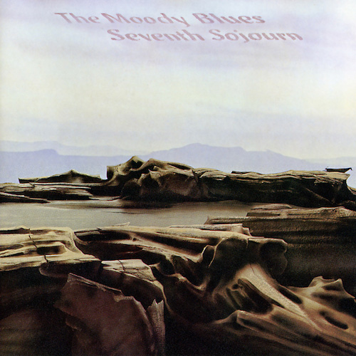
Phil Travis was the cover artist for most of The Moody Blues’ classic stretch, and though he never got the same fame as Hipgnosis or Roger Dean, his covers proved equally iconic. Never putting the band itself on the cover, he varied his images to suit the album, from the colorful space scene on On the Threshold of a Dream to the storybook of Every Good Boy Deserves Favour. For Seventh Sojourn, he came up with a landscape of desolate beauty, which reflected the unrest in many of the songs, as well as within the band, which would split up for a time afterward.
Utopia – Swing to the Right
(1980, Illustrated by Lisa Arnoitz)
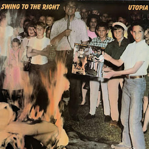
Utopia’s political concept album Swing to the Right spoke to the creeping conservatism of the Reagan years. The cover made a “the more things change…” point by reprinting (and subtly altering) a famous photo from the Beatles record-burnings of 1966, which occurred in response to John Lennon’s “more popular than Jesus” comments. The cover was high-concept in a few different ways. It not only referenced Utopia’s previous album Deface the Music – which served as a Beatles homage/parody – but replaced the original photo’s Beatles album with the Utopia album, making the picture an infinite loop.
Uriah Heep – The Magician’s Birthday
(1972, Illustrated by Roger Dean)
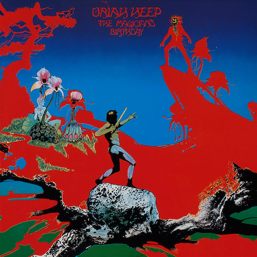
With its dayglo splashes of blue and red, the cover of Uriah Heep’s The Magician’s Birthday is arguably Roger Dean’s greatest prog rock album covers (Yes covers notwithstanding), and one of the most vivid fantasies ever to adorn an album. It was the perfect match for an album that played a notable part in inventing prog metal. Effectively an illustration of the album’s epic title track, it’s about a good and evil magician in a spell-casting tournament, and what fantasy artist could resist illustrating that?
Family – Fearless
(1971, Designed by John Kosh)
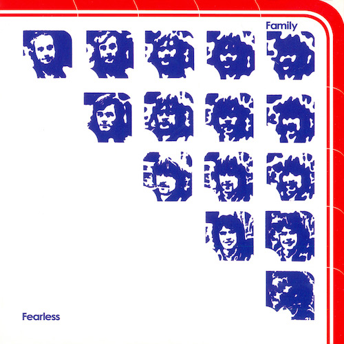
In 1971, John Kosh was one of the hottest British designers who took a cue from the advertising world, designing the kinds of images that would jump out of a magazine. He was already a big name, having shot the Beatles crossing Abbey Road and the monolith shot on Who’s Next. The cover of Family’s Fearless cover was an early computer graphic, adding together the band’s five individual photos until they became a blur. There were also multiple foldouts to make it fancier. After designing the Bandstand cover for Family, he crossed the Atlantic and became synonymous with the California soft-rock visual style of The Eagles, Linda Ronstadt, and James Taylor.
Traffic – The Low Spark of High Heeled Boys
(1971, Illustrated by Tony Wright)
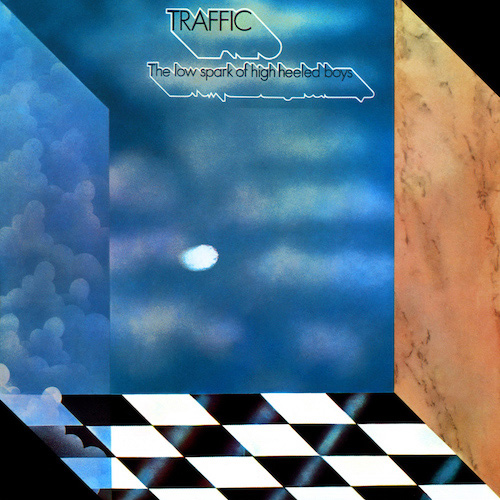
Less was definitely more in the cover design for Traffic’s 1971 album, The Low Spark of High Heeled Boys. By slicing off the upper right and lower left corners of the album sleeve, artist Tony Wright created a three-dimensional effect, with a checkerboard tiled floor leading into a room full of open sky. Depending on how your eyes landed, the image either came out at you or stretched away into infinity. It suggested endless possibility, which is exactly what Traffic’s music was all about at the time.
Pink Floyd – Animals
(1977, Illustrated by Roger Waters and Hipgnosis)
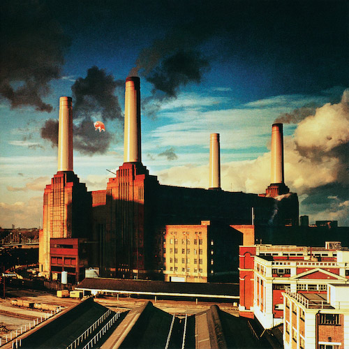
The Hipgnosis team spared no expense when it came to Pink Floyd covers. But the idea for the Animals cover came from Roger Waters, who hated the original cover Hipgnosis proposed (a mock-storybook drawing of a child witnessing his parents copulating). Waters envisioned a huge inflatable pig flying over the bleak urban setting of Battersea Power Station in London. It took three tries to get the 40-foot creature aloft; in the second attempt, it came loose and invaded the Heathrow Airport flight path, much to the British press’s amusement. They got it right the third time, though there was one problem: It was a beautiful sunny day, completely the wrong mood for this album; so they swiped the pig into a stormier scene from the first attempt.
Caravan – Cunning Stunts
(1975, Designed by Hipgnosis)
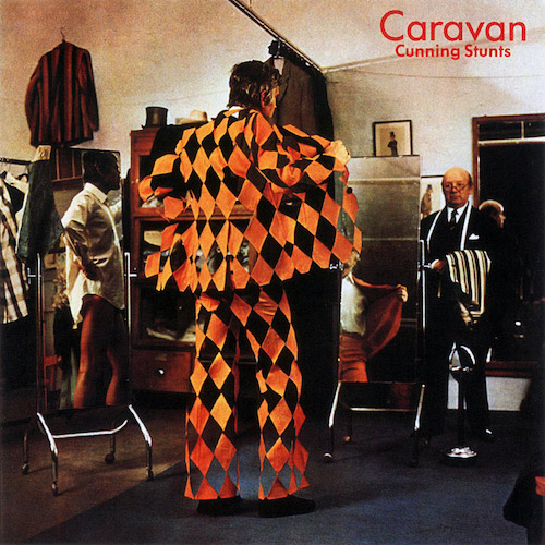
The Hipgnosis crew always enjoyed a surreal gag, and if an album title had an obvious double meaning (particularly sexual in nature), they’d usually ignore it and go for something less obvious. So for Caravan’s Cunning Stunts record, they give you an actual cunning stunt, a suit whose design renders the wearer invisible. They also may have been working off the album’s original title, Toys in the Attic, which Caravan gave up when a more famous band claimed it.
Curved Air – Air Conditioning
(1970, Illustrated by Mark Hanan)
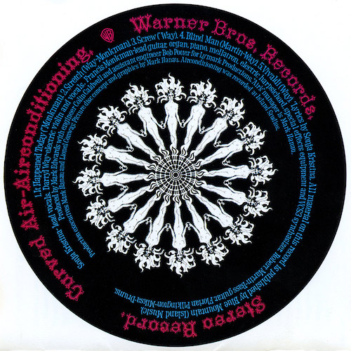
One of the ultimate eye-grabbers and greatest prog rock album covers, Curved Air’s U.K. debut Air Conditioning was – as far as anyone can remember – popular music’s first 12-inch picture disc. Packaged in a clear sleeve, Mark Hanan’s light and dark kaleidoscopic designs incorporated the credits and song titles, and was designed to look especially hypnotic when spinning on a turntable. The U.S. audience got shorted on this one; getting a conventional cardboard cover until the pic-disc was reissued in 2018.
Jethro Tull – Thick As A Brick
(1972, Designed by Jethro Tull and Roy Eldridge)
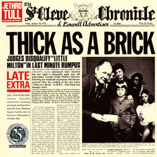
Jethro Tull’s famous newspaper cover for Thick As A Brick was perhaps the first album sleeve that a non-stoned person could spend many hours perusing. Indeed, the 12-page newspaper was so well done that many buyers fell for its preposterous backstory of eight-year-old Gerald Bostock and his epic poem (the fictional Bostock was officially credited as the album’s co-writer). Bandmembers Ian Anderson, Jeffrey Hammond-Hammond, and John Evan wrote most of the text, with help from Chrysalis staffer and former newspaperman Roy Eldridge. The style of writing owes a lot to Monty Python, with its sustained surreal gags, puns and wordplay, and no shortage of winking sexual humor. There’s even a fake review of the album, written by one Julian Stone-Mason B.A., who wasn’t that impressed.
Emerson, Lake & Palmer – Brain Salad Surgery
(1973, Illustrated H.R. Giger)
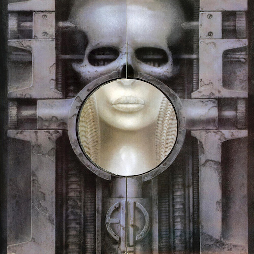
When Keith Emerson was introduced to the famed artist H.R. Giger through Emerson, Lake & Palmer’s European tour promoter, he found just the vehicle for the kind of imagery he was after. At that point, the album was to be called Whip Some Skull on Ya, and Giger’s imagination went to work on the phrase’s combination of skulls and sexuality. The cover wasn’t changed when ELP came up with the final title Brain Salad Surgery (which like the original one, referred to a sex act) but it was toned down just a bit. The shaft of light was originally something more explicit. One surprising bit of trivia: When Emerson visited Giger he saw an early version of the “penis landscape” painting that would get the Dead Kennedys into big trouble when they included it in their Frankenchrist album.
King Crimson – In the Court of the Crimson King
(1969, Illustrated by Barry Godber)
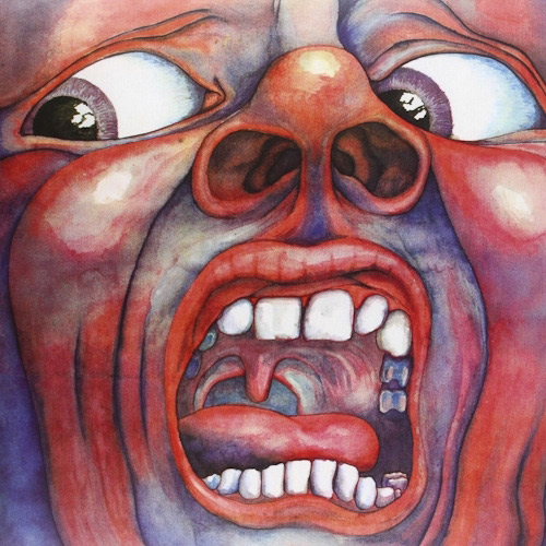
The artist behind one of the greatest prog rock album covers was not a professional artist. Barry Godber was an art-school friend of King Crimson lyricist Pete Sinfield and was then working as a computer programmer. Recruited by Sinfield to create a cover for their 1969 album, In the Court of the Crimson King, Godber got knocked off his feet by “21st Century Schizoid Man,” and painted exactly what he saw. Robert Fripp in particular loved the dramatic nature of the painting. It was Fripp’s idea to put no artist or title on the front or back cover, a radical idea at the time (and a risky one for a debut). Sadly, Godber had a fatal heart attack soon after its release; the painting is now owned by Fripp.
Yes – Relayer
(1974, Illustrated by Roger Dean)
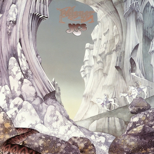
Though Roger Dean did the artwork for dozens of bands, he’s most closely aligned with Yes, whose logo he also created. And the link between Yes’ musical and Dean’s visual imagery is no coincidence. “I felt that if the band was making an effort to reinvent music, that there was an obligation to have this product look like it came from the place where the music allegedly came from,” he explained. His most striking Yes cover, 1974’s Relayer, may be the one most closely keyed to the music. The war-and-peace themed album is Yes’ most dramatic, and Dean departed from his usual splashes of color to create a forbidding wintry landscape with marching soldiers and a guard snake (Dean was working off the album’s original title, The Gates of Delirium). The cover also has a hidden secret: It forms a continuous scene when you put its front cover to the left of the back cover of Yes’ previous album, Tales From Topographic Oceans.
Rush – Moving Pictures
(1981, Designed Hugh Syme, photographed by Deborah Samuel)
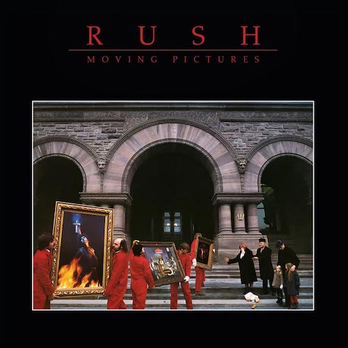
Longtime designer Hugh Syme was right in tune with Rush’s cerebral sense of humor, which found its finest expression on one of their best-loved albums, Moving Pictures. The 1981 cover makes a triple visual pun on the title, with a crew moving paintings out of a museum, teary onlookers being moved by the scene, and a movie crew filming it. There are subtler jokes too: How many museums would have a chilling painting of Joan of Arc’s death right next to one of dogs playing poker? (There’s an infinite loop here too: Joan is played by the cover’s photographer Deborah Samuel). Friends of the band are in the crowd, including Crowbar lead singer Kelly Jay as one of the movers; and it was shot at the three-arched Ontario Legislative Building in Toronto. And this beloved cover almost didn’t happen: The label felt that Rush’s concept would cost too much, so the band shelled out the expenses itself.
Looking for more? Discover the 25 Greatest Prog Rock Albums of all time.